Helena Fernández
Miralpeix


Creative Direction
Brand Storytelling
Visual Identity
Sensory Brand System
Packaging Direction
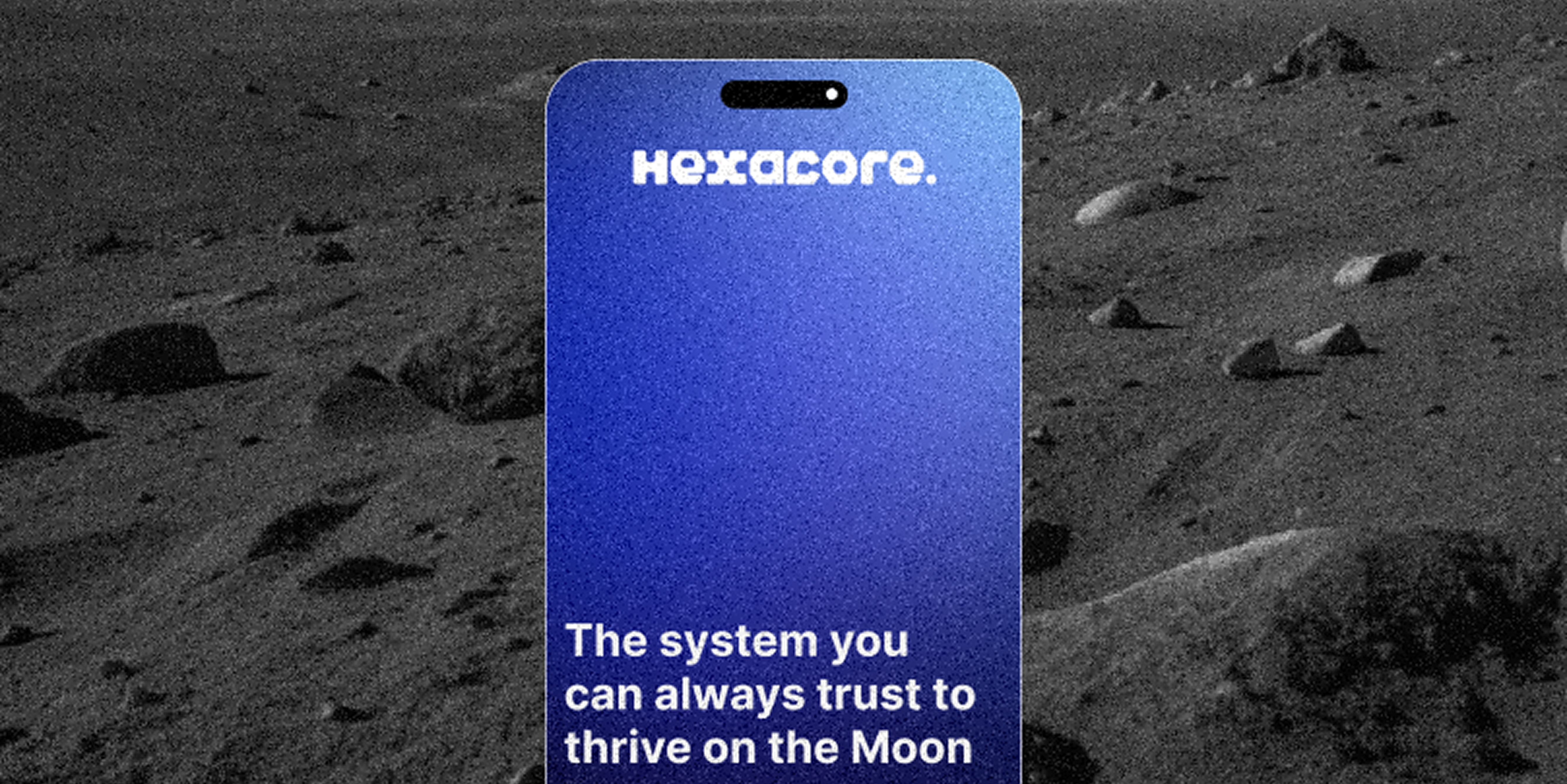
Digital Brand Experience
Year 2025 · Self-initiated conceptual brand universe
Helena Fernández
Miralpeix
Product Designer
Brand Strategist
Creative Direction
I designed lumi as a conceptual product ecosystem to help people recognise, regulate and understand emotional states through soft sensory feedback.
The project explores how wearable and tactile devices could support emotional awareness without turning feelings into diagnosis, surveillance or over-quantified data.
What this case study highlights: creative direction, sensory brand thinking, packaging and interface storytelling can work together to turn emotional technology into a coherent brand universe.
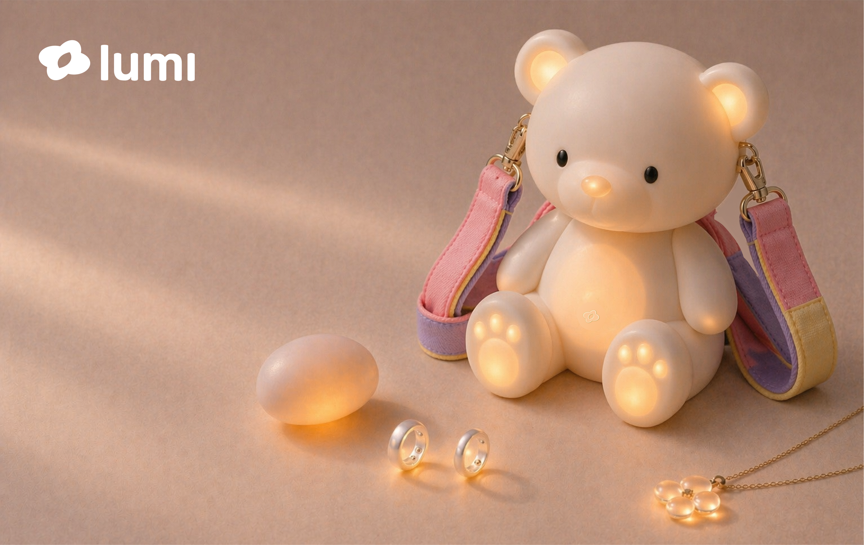
A physical-digital ecosystem designed around emotional awareness, regulation and sensory support.
The creative system connects objects, interface, packaging and communication through one soft sensory logic.
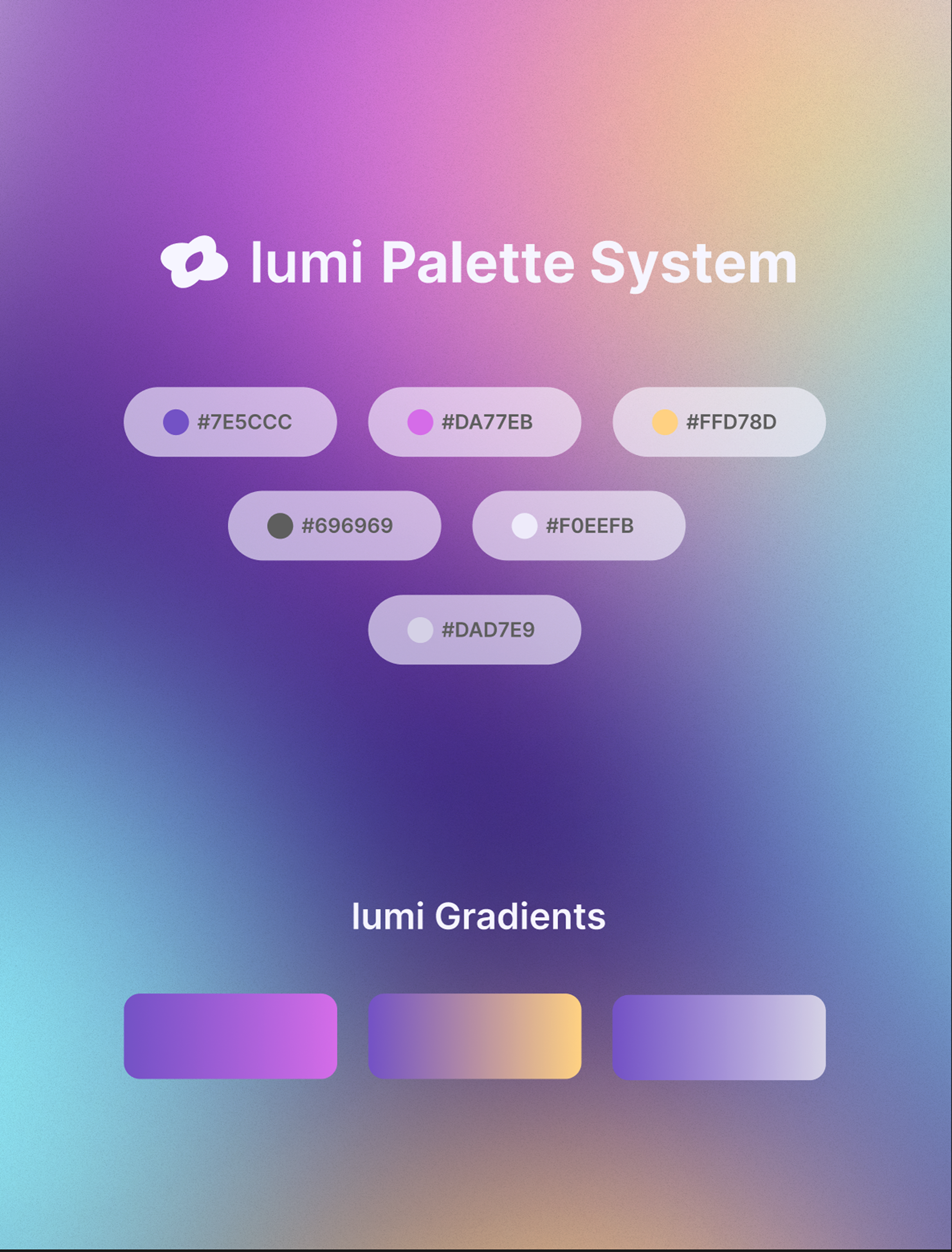
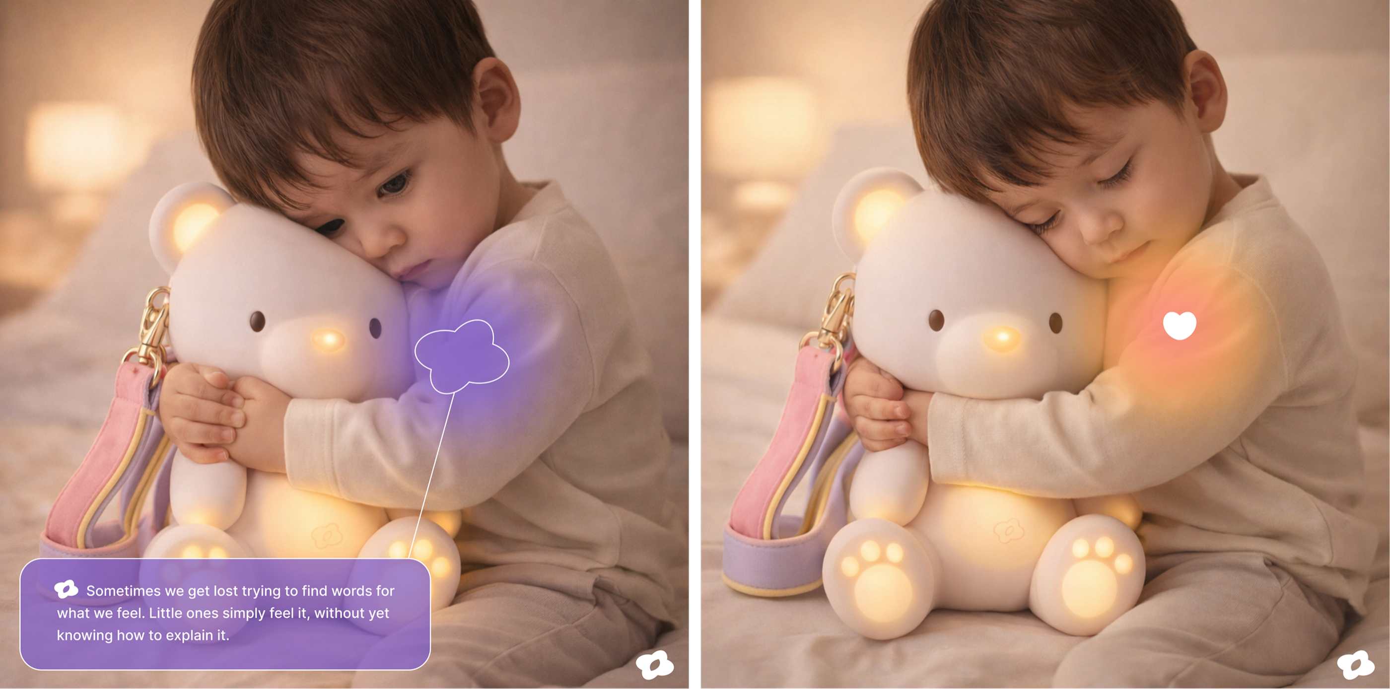
Colour, light and softness are used as emotional signals, not decoration.
The palette and interface language make the brand feel calm, tactile and close to the body.
The digital layer stays quiet: it supports configuration, reflection and continuity.
Screens are treated as a support layer rather than the centre of the emotional experience.
The system creates small sensory moments that help users pause, notice and regulate.
The experience avoids diagnosis, surveillance and over-quantified data, focusing instead on reassurance and self-awareness.

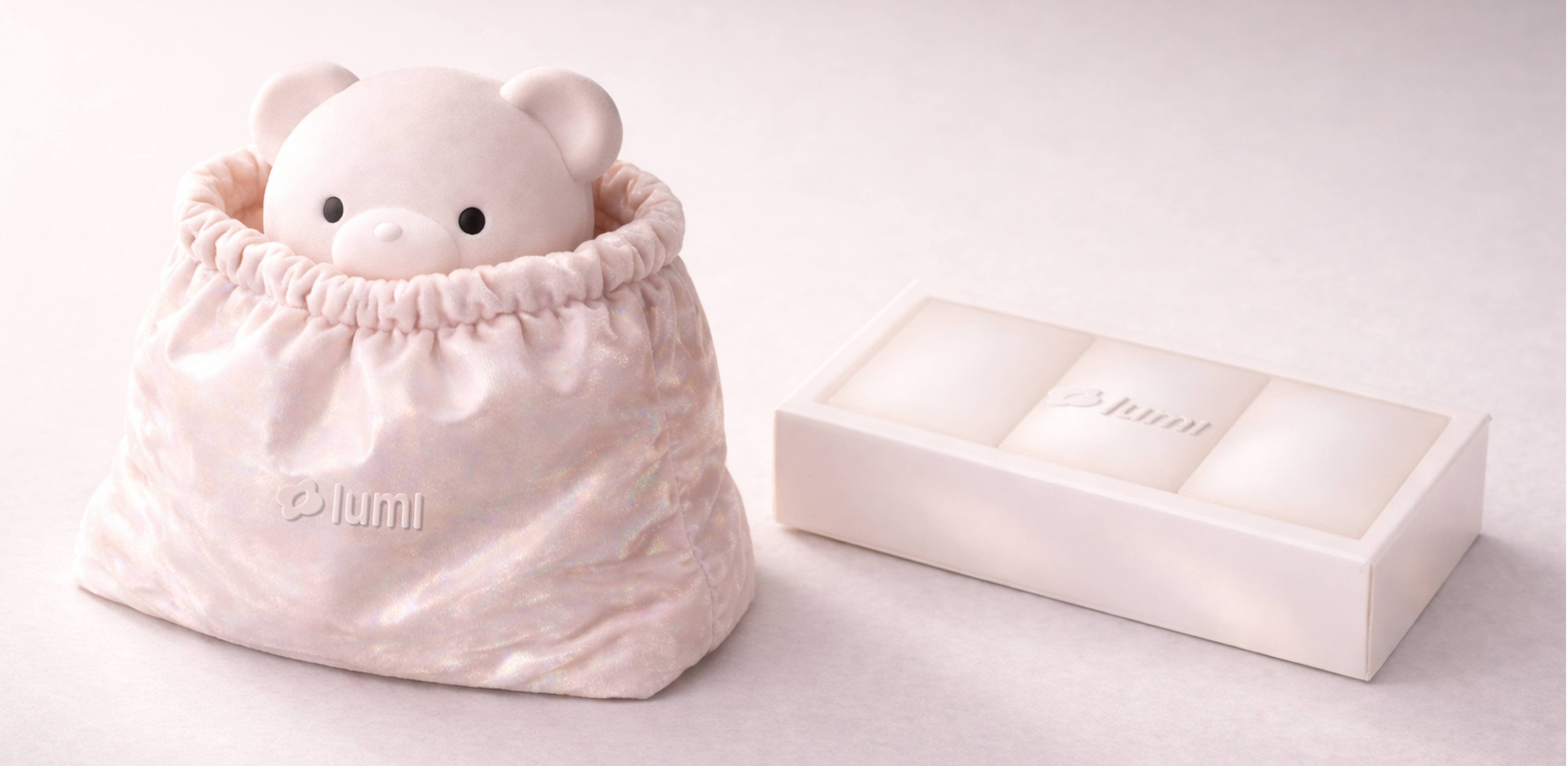
For children and families, the brand becomes softer, more familiar and more protective.
The kids universe uses familiar forms, playful cues and gentle feedback to support shared emotional care.


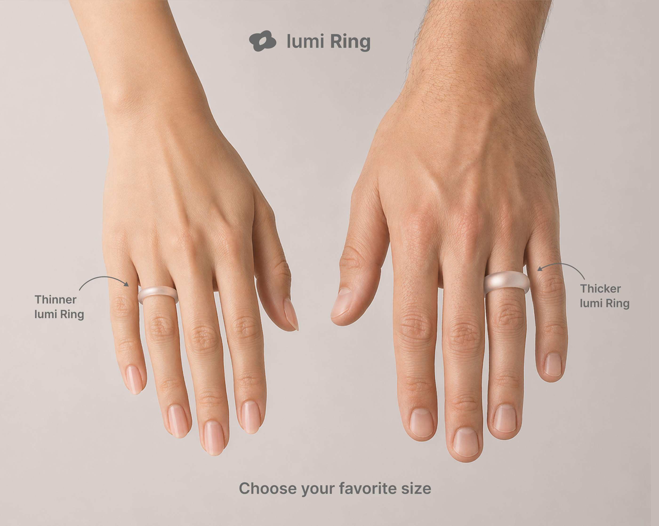
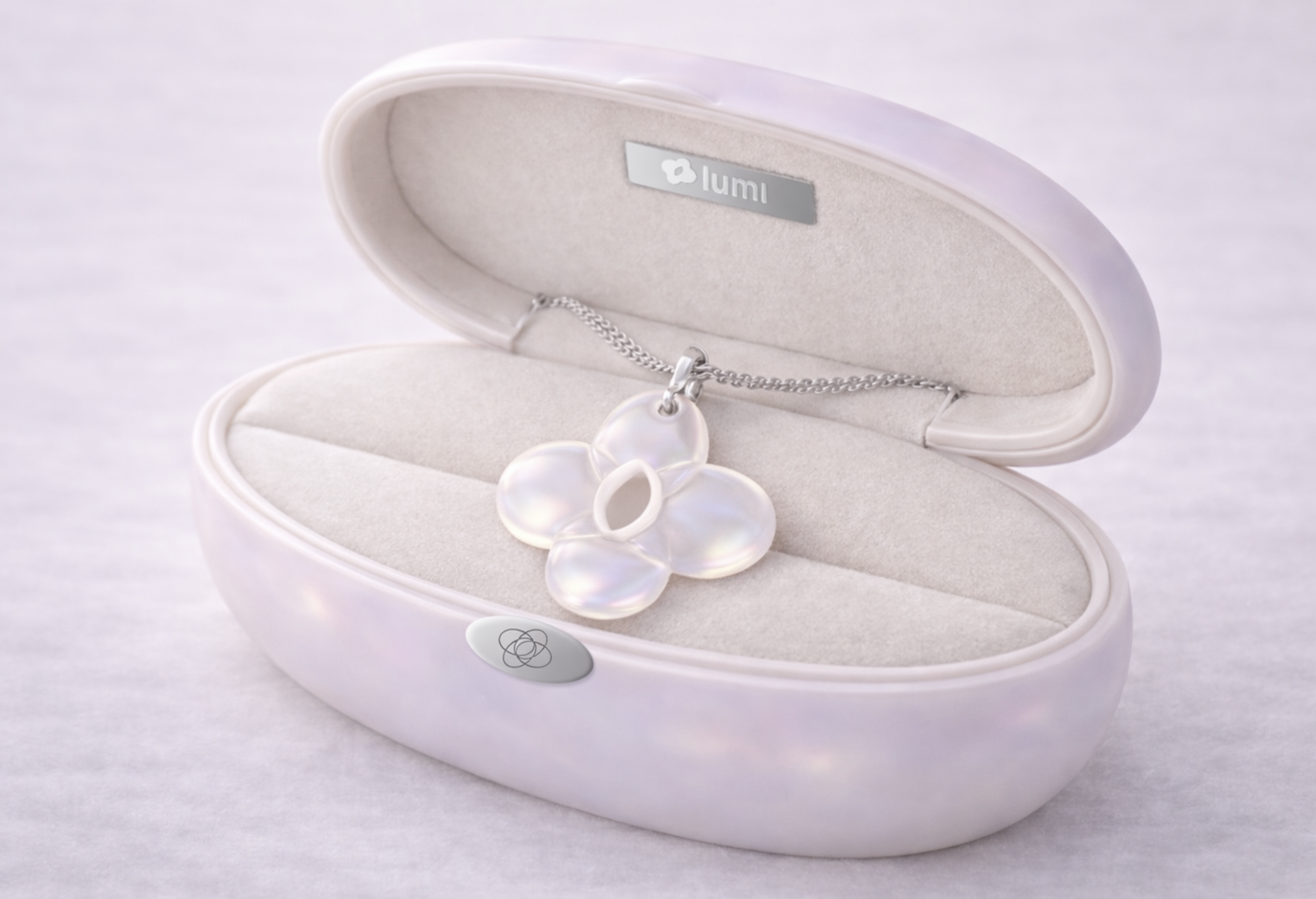
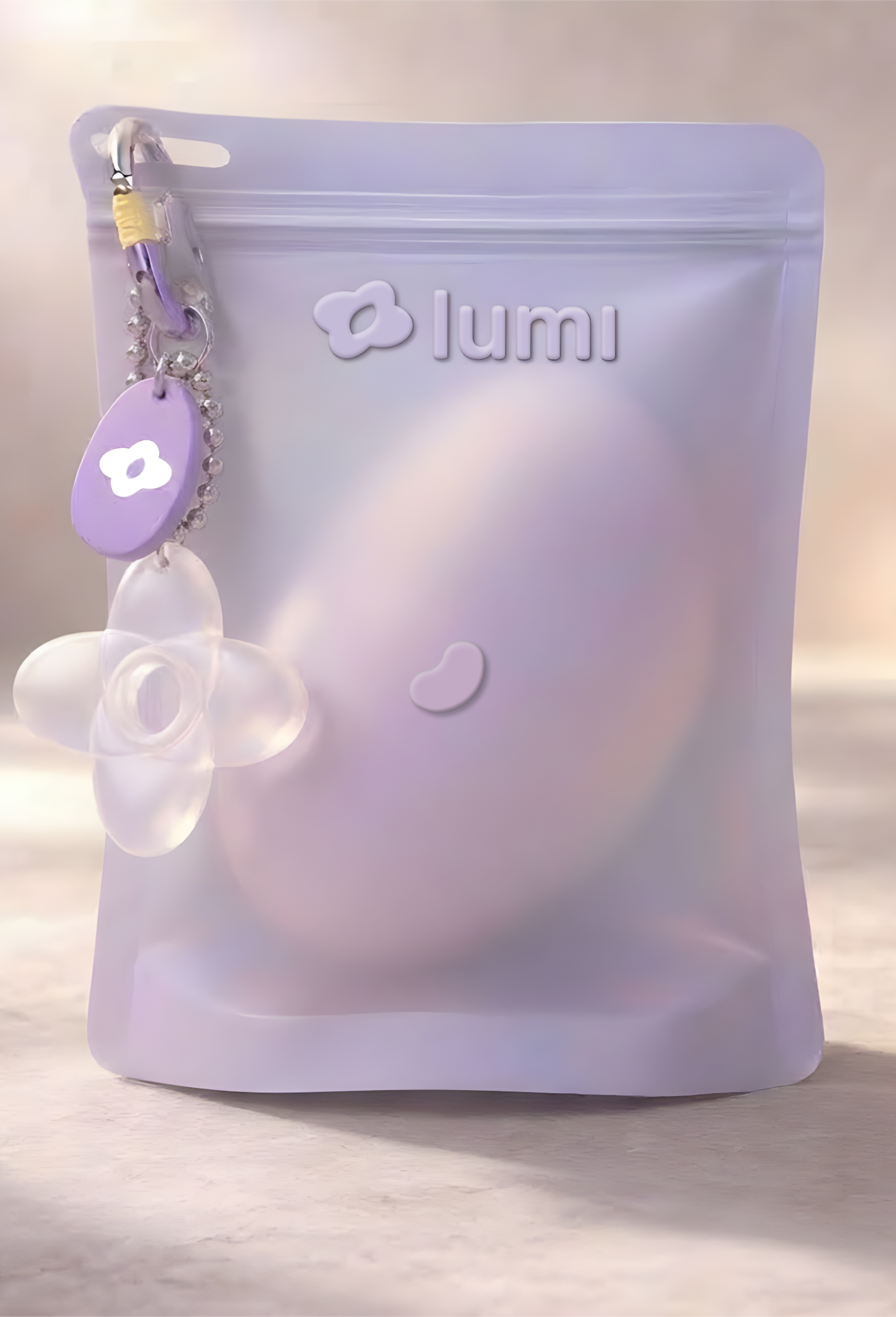
Each object explains the same promise through a different body relationship: wear, hold, carry or hug.
The product family turns one sensory strategy into several daily rituals and contexts of use.
Packaging extends the product strategy: protection, touch and emotional safety before activation.
Cases and boxes make the first interaction feel careful, soft and trustworthy.

The result is a premium sensory universe where product, interface, packaging and communication speak the same calm language.
Every touchpoint reinforces the same brand personality: quiet, protective, sensory and emotionally secure.