Borja
Casado Antón


Product Design
UX/UI
User flows definition
Visual system
Interaction design
Brand systems
MVP thinking
Independent product case study · Developed MVP · 2024
Borja
Casado Antón
FullStack Developer

Helena Fernández
Miralpeix
Digital Product Designer
UX/UI
Brand Systems
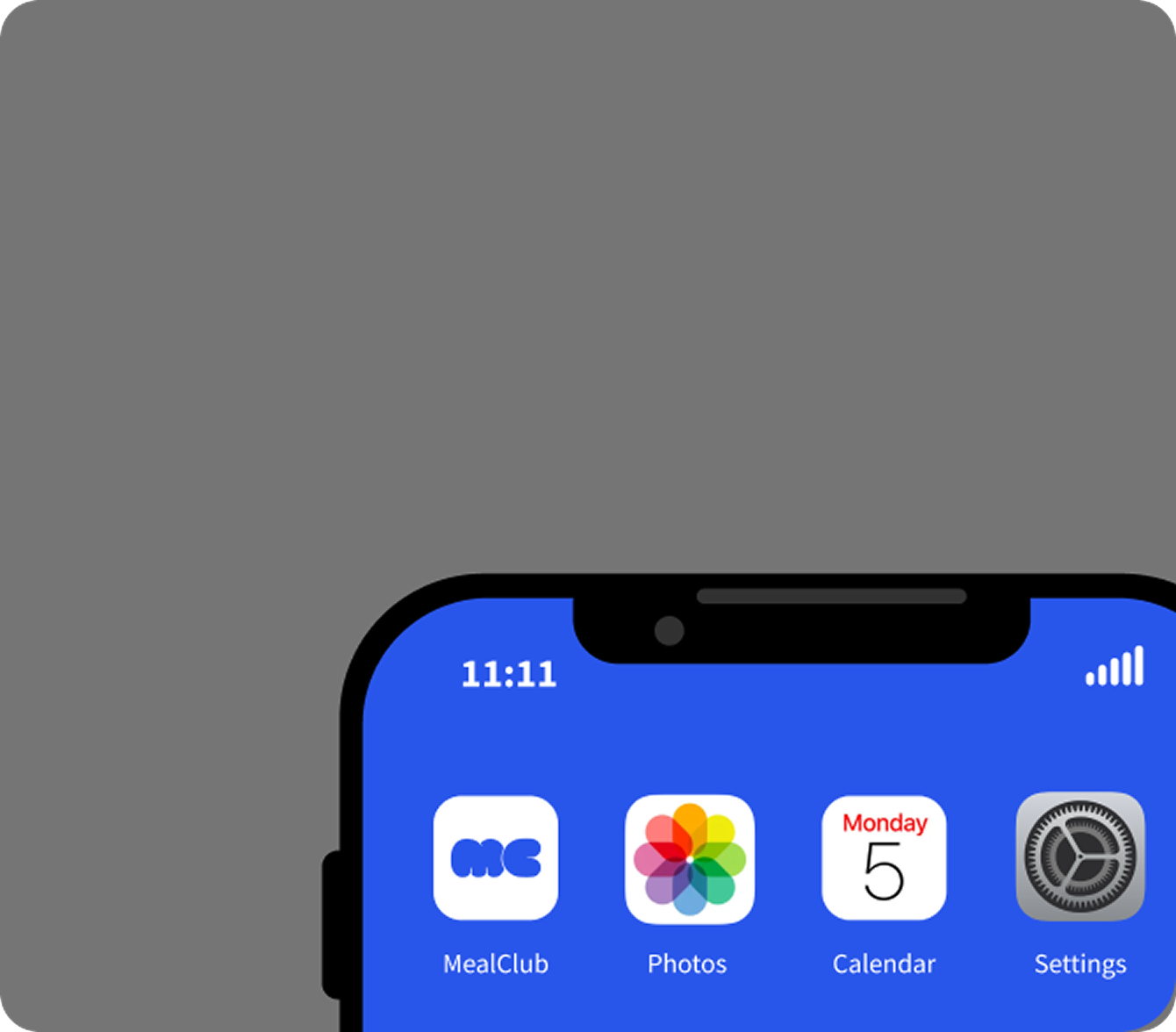
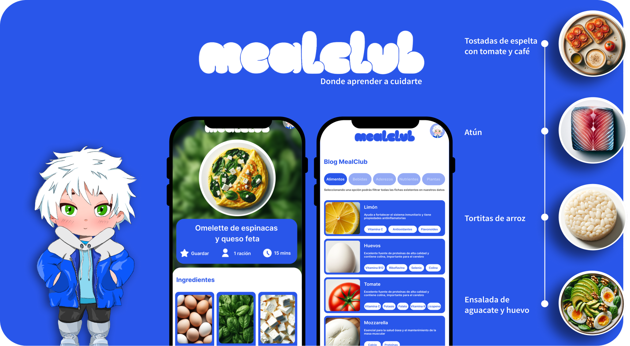
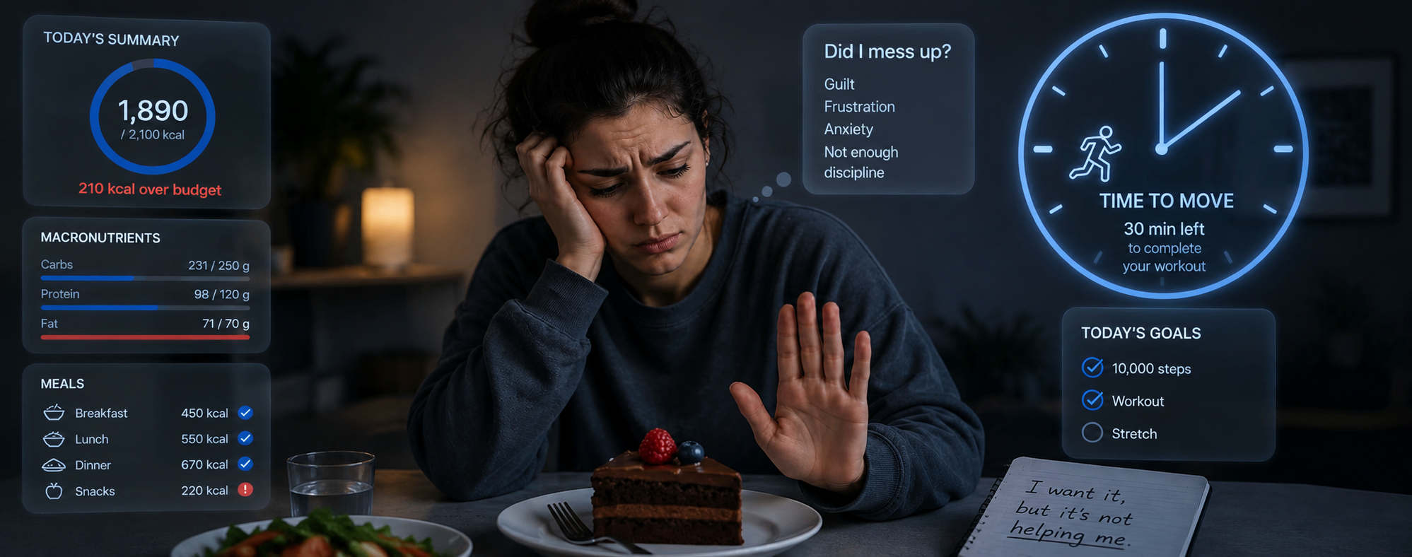
MealClub is a developed MVP designed to make meal planning easier, more personal and more educational. The product translates research insights from 300+ participants into a mobile experience focused on recommendations, explanations and weekly planning.
The project focuses on reducing friction in meal planning by offering a clear, visual and motivating experience that supports habit formation and long-term decision-making.
Overview
What the product is about
MealClub is an independent product case study and developed MVP exploring how meal planning can become a more educational, habit-building and user-friendly experience.
The product turns a broad nutrition problem into a focused mobile experience: user context, meal suggestion, explanation and save or plan actions.
A habit-building mobile product designed around meal planning, educational guidance and repeatable decisions.
Nutrition becomes easier to understand through contextual explanations instead of strict tracking.
I led product strategy, UX research, UX/UI design, visual system and implementation coordination.
Product research & opportunity:
Mapped the gap between tracking apps, recipes and educational food guidance.
Experience strategy:
Structured the loop: user context, meal suggestion, explanation and save or plan action.
UX/UI system design:
Designed reusable screens, cards, navigation and content modules.
Brand & visual direction:
Built a visual system that makes nutrition feel clearer, lighter and easier to maintain.
Implementation coordination:
Translated UX decisions into responsive, reusable interface logic.
An independent product case study focused on meal planning, nutrition education and habit-building, developed with FullStack collaboration.
Product opportunity, user flows, onboarding, recommendation logic and UI system.
I led concept, product strategy, UX/UI and creative direction, with Borja Casado Antón supporting FullStack development.
Key product decisions
From broad healthy habits to an adaptive food-learning MVP
MealClub explores how a nutrition product can move beyond “what should I eat?” and help users understand, adapt and repeat food decisions through recipes, tracking and practical learning.
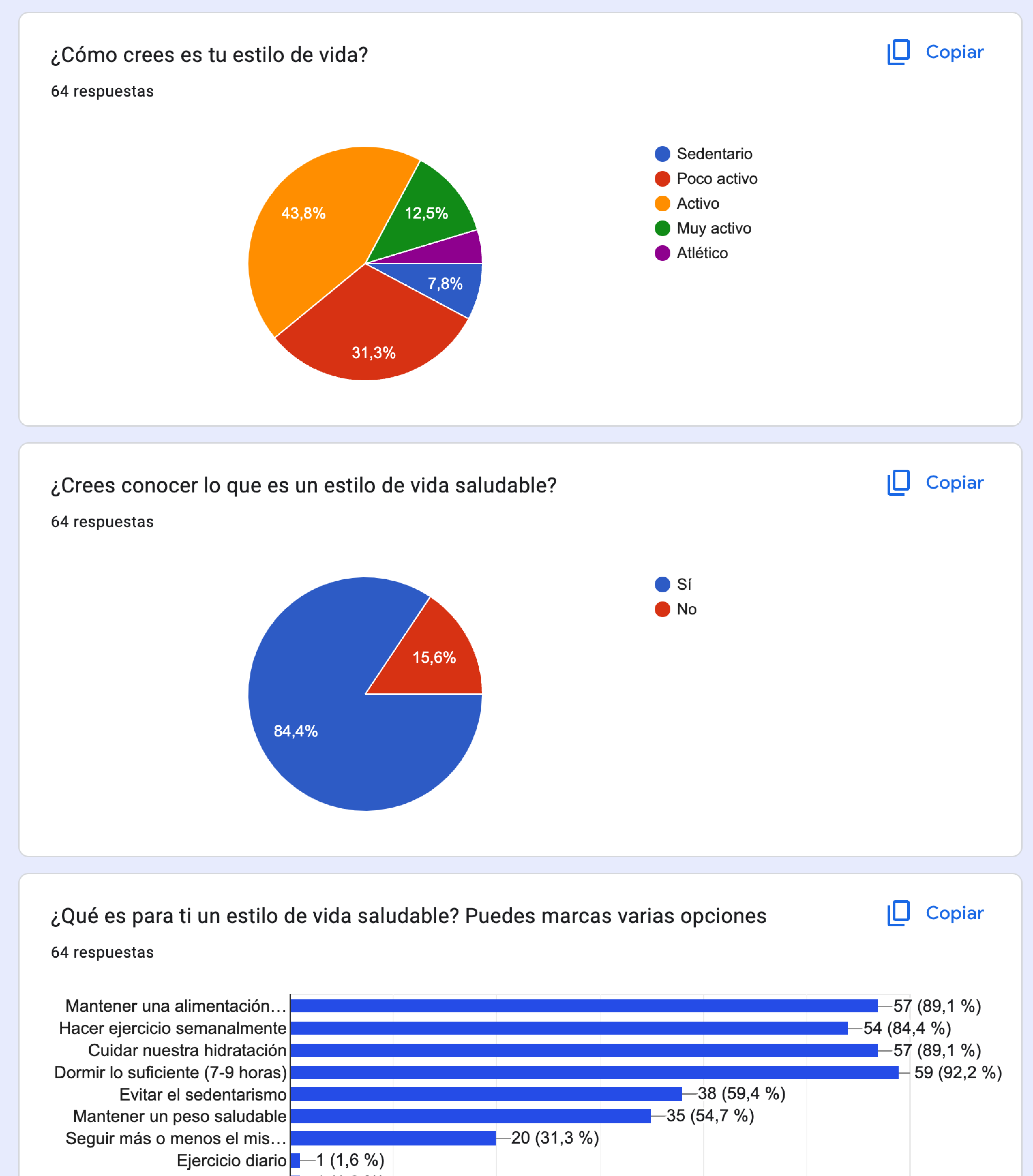
The survey helped define the MVP strategy: although users associated a healthy lifestyle with food, exercise, sleep, hydration and movement, the first version needed to focus on the area where the product could create the clearest daily value: food understanding.
Instead of prioritising sport routines as a core MVP feature, MealClub focused on recipe creation, food tracking and educational guidance. Movement and exercise remained as complementary learning content, while the main product loop centred on helping users understand what they eat, why each recommendation makes sense and how to adapt meals to their goals, preferences, time and real-life context.
Insight
Phase 1.1 · Initial user research
MealClub started with a product question: can meal planning help users make repeatable decisions without rigid plans, calorie tracking or dependency?
Interviews and surveys with more than 300 users showed that people often struggle less with knowing what is healthy and more with turning that knowledge into repeatable decisions. This shaped the product around guidance, explanation and habit formation.
Health app abandonment within 90 days.
Fitness app abandonment within 90 days.
Median abandonment within the first 100 days.
Most studies reported abandonment above this level within 100 days.
A 2024 scoping review in the Journal of Medical Internet Research found high abandonment rates across health, fitness and lifestyle behaviour apps.
This reframed the product direction: MealClub needed to make food planning easier to understand, repeat and return to, instead of relying on tracking, restriction or reminders.
Source: Journal of Medical Internet Research, 2024 — “When and Why Adults Abandon Lifestyle Behavior and Mental Health Mobile Apps: Scoping Review.”
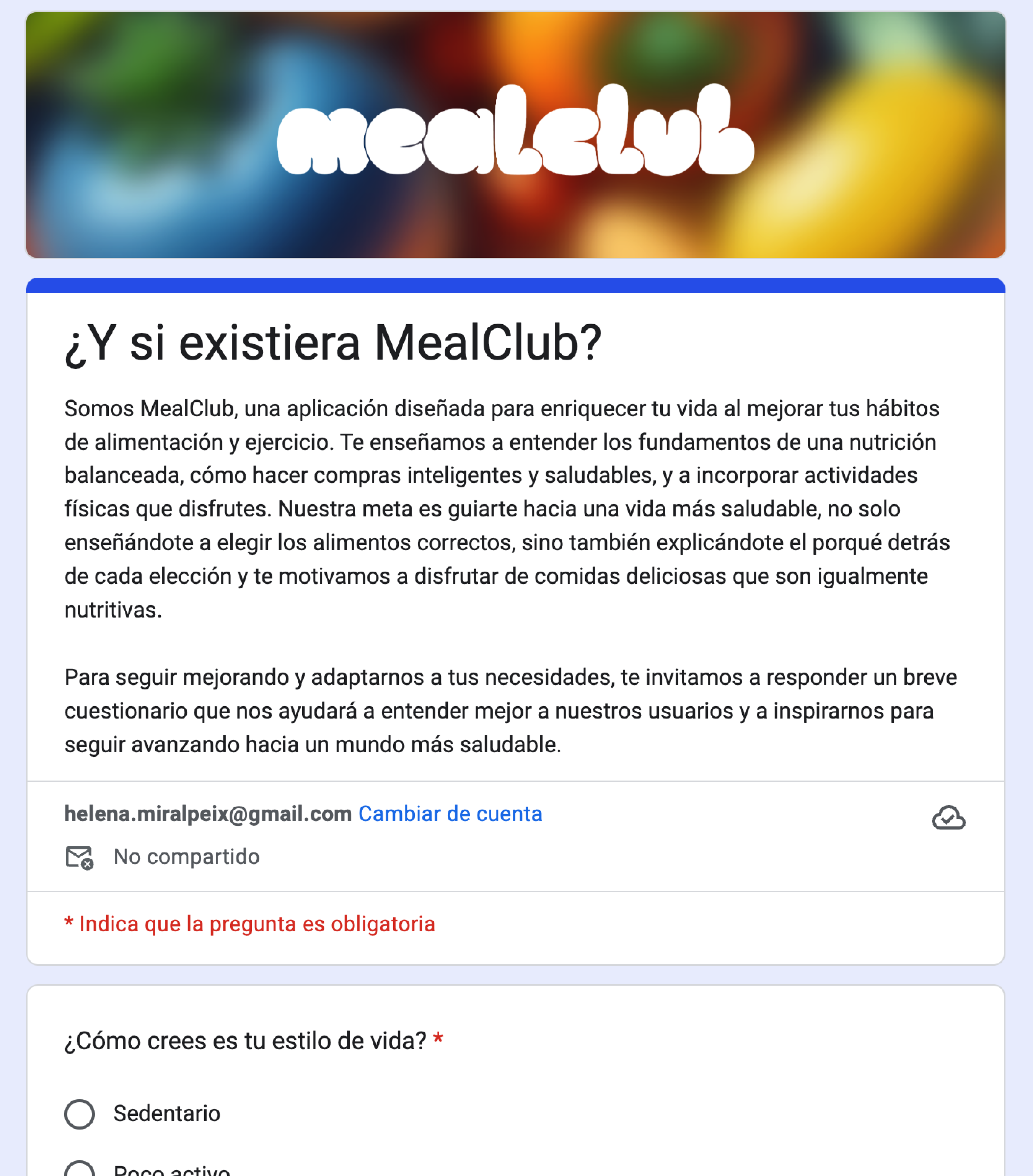
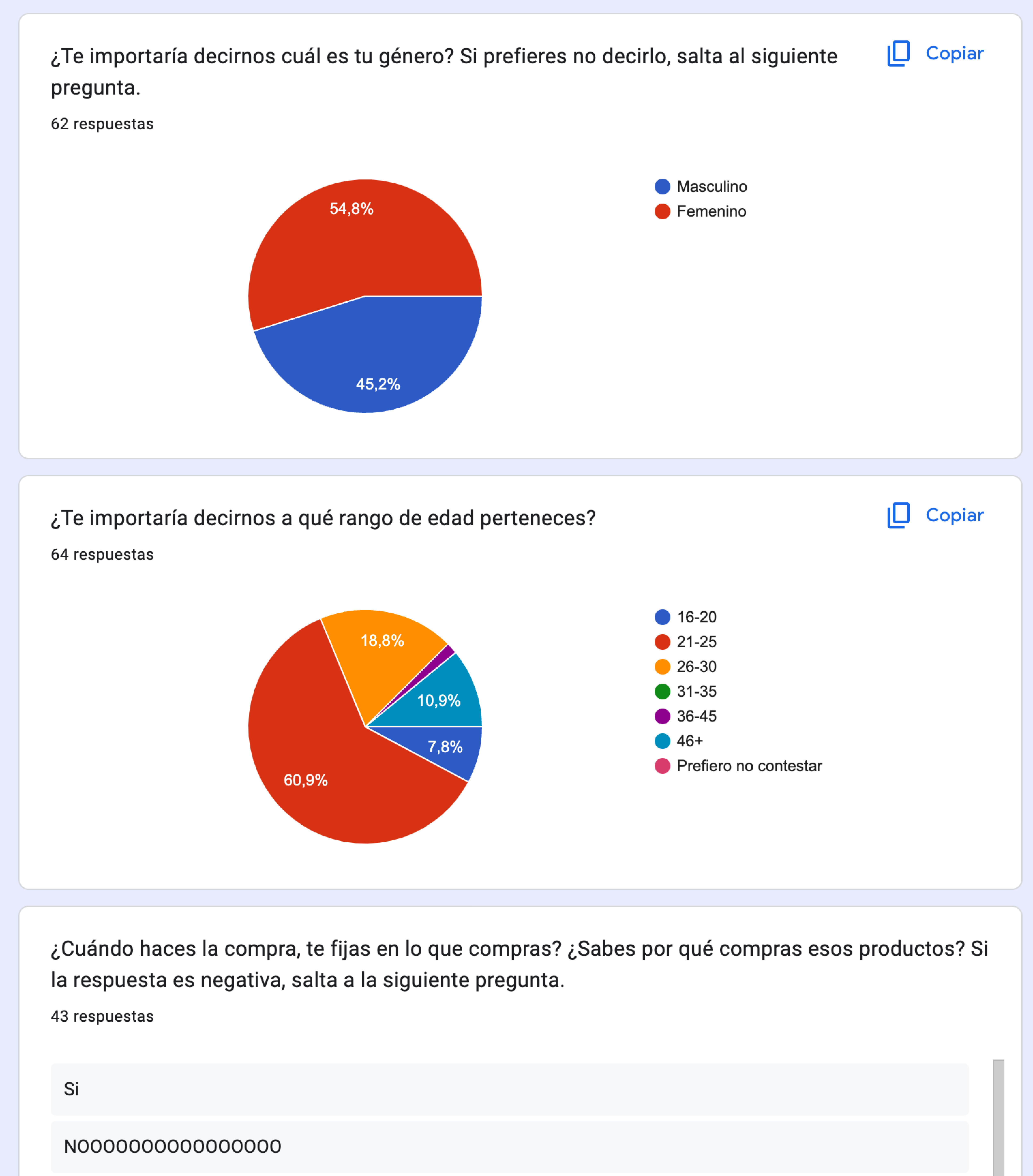
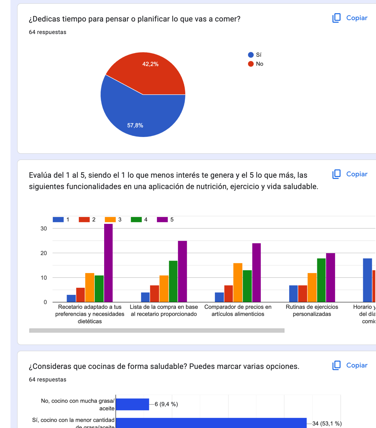
Fieldwork with more than 300 people helped identify
low nutritional confidence, changing routines and the need
for clearer, more contextual meal guidance.
Problem statement
Phase 1.2 · Problem framing
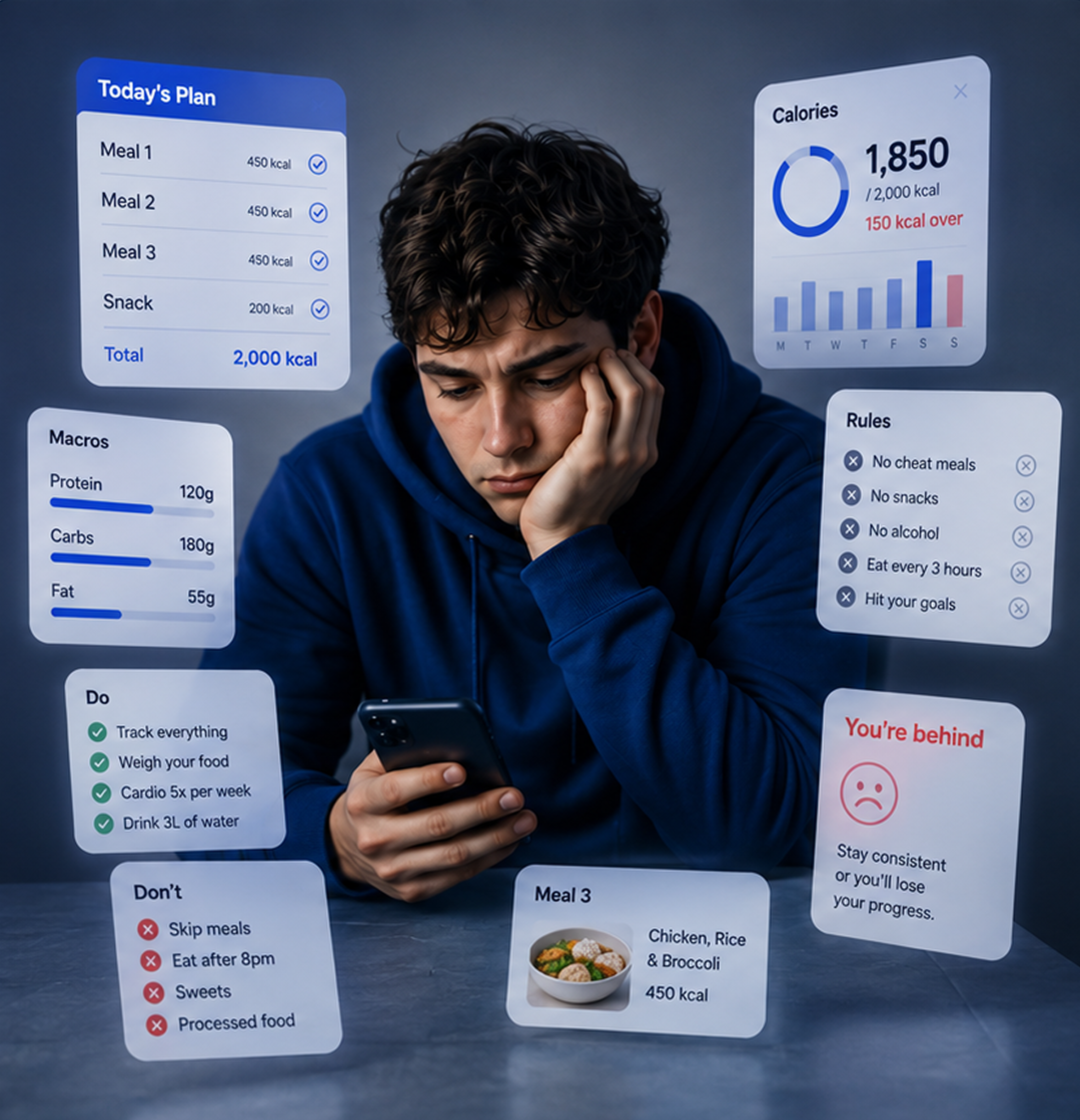
Most nutrition apps give users predefined plans, but rarely help them understand why choices matter or how to adapt them to real life.
Move beyond restriction, tracking and calorie control by focusing on the daily decisions users actually struggle to repeat.
Use guidance, clarity and learning instead of number dependency, so users understand the reason behind each suggestion.
Reframe nutrition as self-awareness and habit-building, with a product tone that supports progress without pressure.
"The opportunity was not to create another plan. It was to design a system that helps users understand themselves."
User needs
Phase 1.3 · Use case definition
Research became two priority contexts: users who need quick planning help and users who want to understand their choices.
This shaped onboarding, recommendation logic, educational content and the first MVP flow.
Needs fast guidance, clear meal ideas and flexible planning without building a full plan from scratch or comparing too many options.
Needs contextual explanations, visual cues and small learning moments that build autonomy instead of creating dependency on fixed diet rules.
Discover and plan meals without strict diets or dense nutrition data, moving from inspiration to a concrete daily choice faster.
Recommendations adapt to routine, energy, training, rest or emotional context, making advice feel relevant to the moment.
Explain why meals, combinations or habits make sense, so each interaction teaches something small and reusable.
Show routines and decisions clearly so users can recognise patterns and adjust without feeling judged.
Creative Direction
Phase 2.1 · Product strategy & visual direction
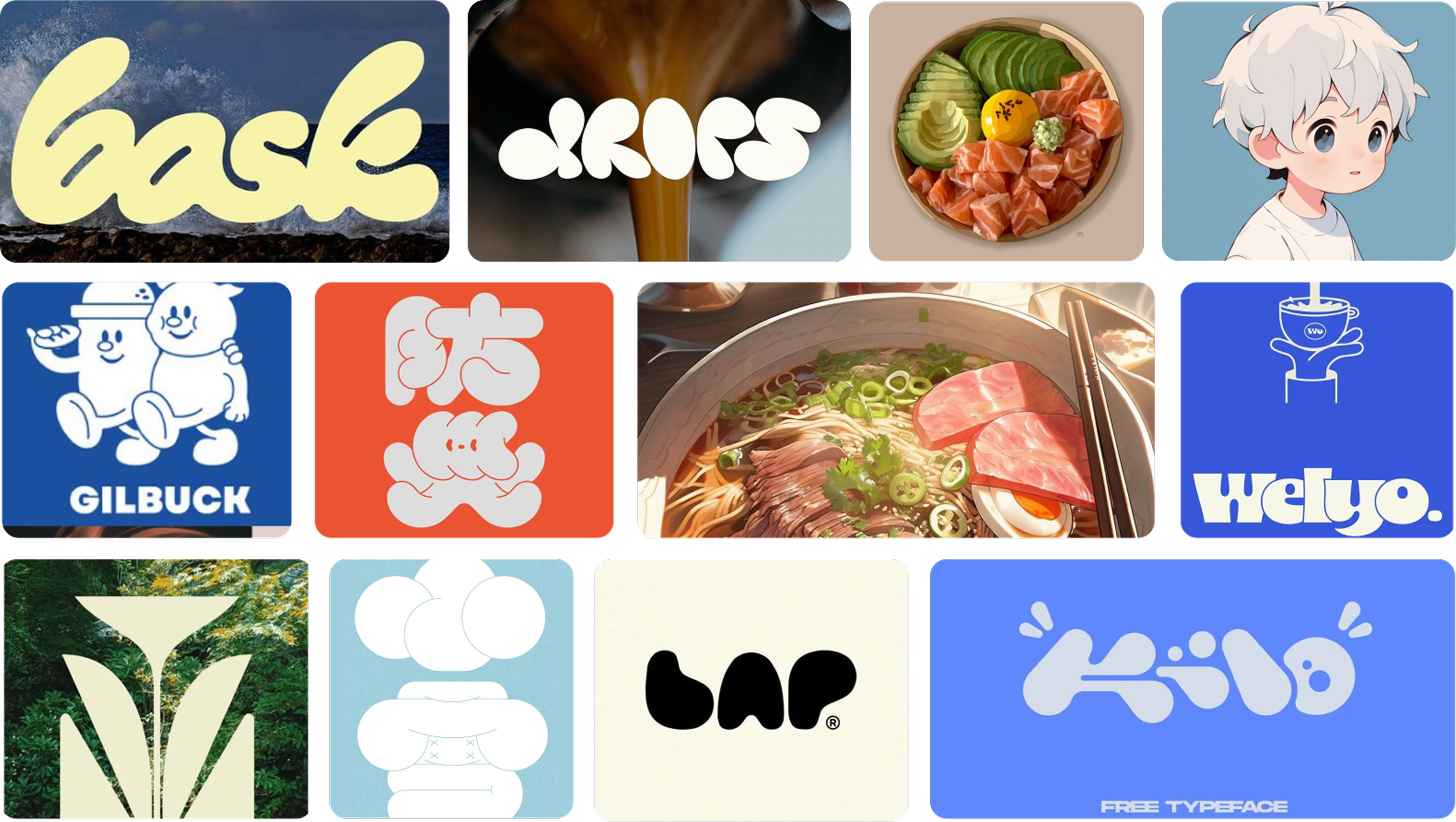
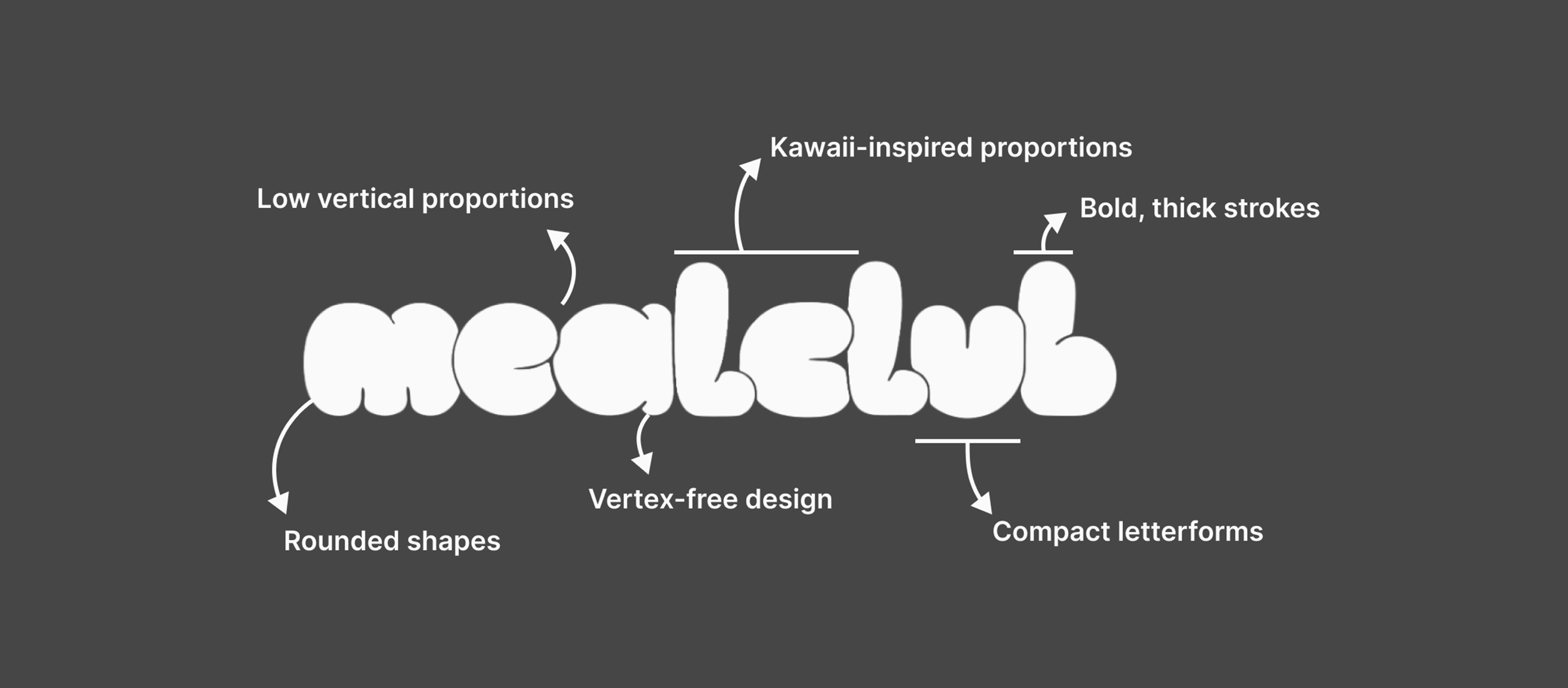
I shaped the visual direction to make nutrition feel approachable, warmer and less clinical.
MC, colour and food imagery turn guidance into a product language that feels friendly without losing clarity.
The creative layer avoids the clinical or restrictive tone common in wellness products. Rounded shapes, bold blue, food photography and the MC companion make learning feel visual, friendly and memorable while still supporting product clarity.

Strategic principles
Phase 2.2 · Product decision criteria
Strategic principles kept MealClub focused on education, clarity and sustainable behaviour change.
Every feature, recommendation and screen had to reinforce education, clarity and sustainable behaviour change. The criteria helped filter ideas that felt useful but could add pressure, noise or dependency.
Help users understand nutrition instead of telling them what to eat, turning recommendations into explanations rather than orders.
Simple recommendations and contextual explanations act as a pocket mentor that reduces uncertainty without adding guilt.
Structure information to reduce confusion, prioritising the next useful action over dashboards full of numbers.
Encourage sustainable routines over fast restrictive outcomes, so progress can survive changing schedules and real-life interruptions.
Product positioning
Phase 2.3 · Defining the product angle
MealClub is not a calorie tracker. It is positioned as a learning-based meal planning product.
The product was positioned as a learning-based meal planning experience: supportive, educational and flexible. Instead of measuring success only through numbers, the concept focuses on helping users understand what to eat, why it fits and how to repeat better decisions.
MVP Scope
Phase 3.1 · Defining the first usable version
The MVP validates one core loop: user context, meal suggestion, explanation and save or plan action.
Before adding tracking, community or deeper personalisation, the first version focuses on helping users identify a need, receive a relevant meal suggestion, understand why it fits and save or plan it for later use.
A focused recommendation feed that turns the user's context into practical meal options without overwhelming the first session.
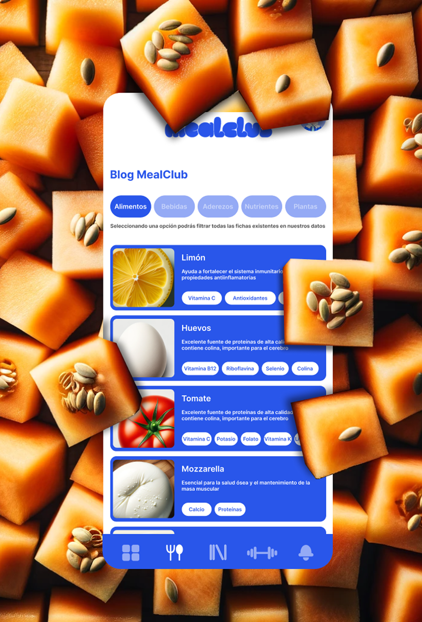
Short explanation modules that show why a recipe, ingredient or habit fits the user's current need.
Save and planning actions that help users turn isolated ideas into reusable weekly decisions.
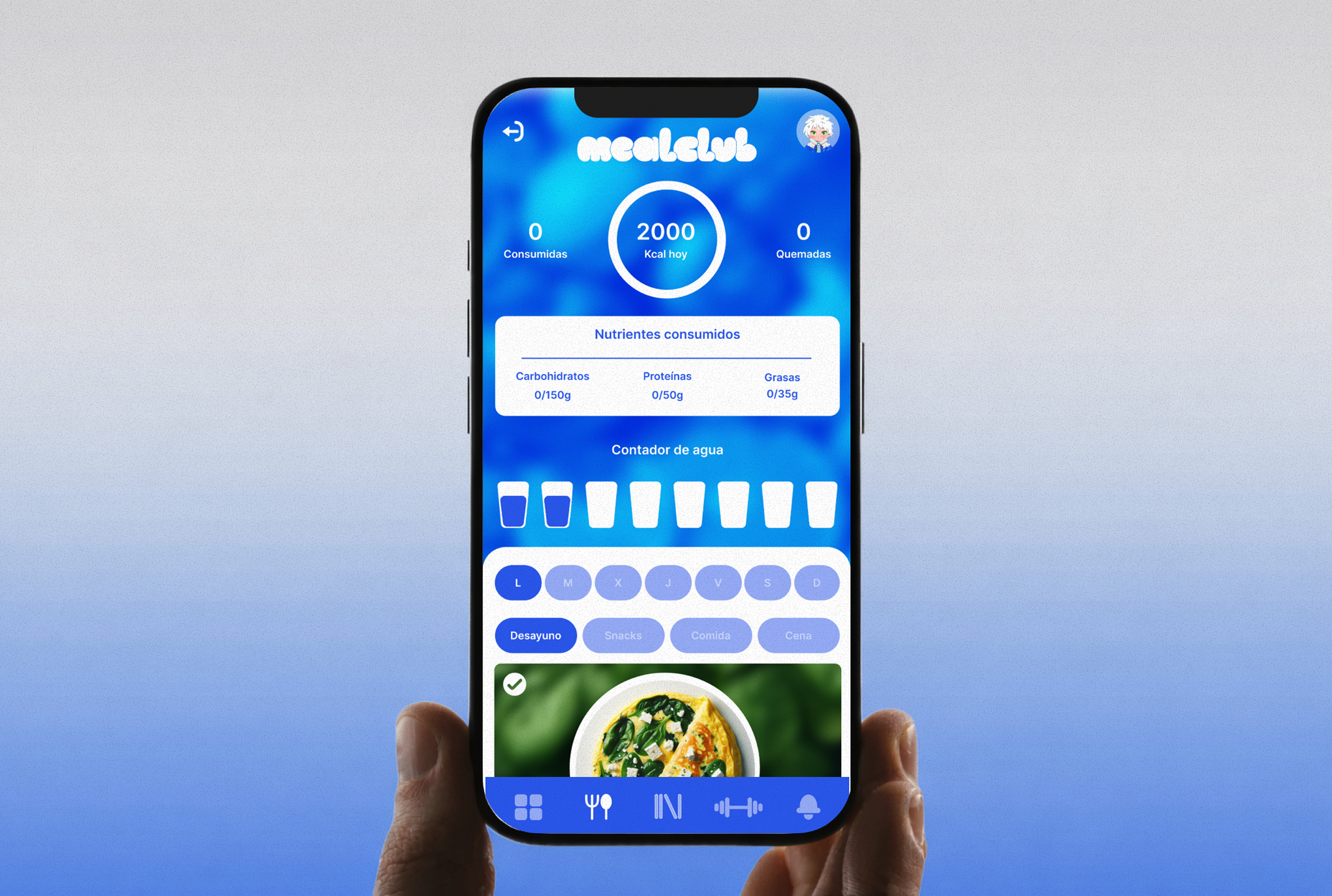
Lightweight feedback that helps users recognise routine patterns without turning the app into a strict tracker.
Core experience flow
Phase 3.2 · From need to action
The main flow moves users from uncertainty to a confident food decision quickly.
Context selection, meal discovery, educational content and planning work as one repeatable loop.
Each step has a specific job: capture the situation, reduce the number of options, explain the value of the recommendation and make the decision reusable. This keeps the flow useful without turning it into a long setup process.
The user starts by selecting a situation, need or moment of the day, such as training, rest, low energy or meal planning.
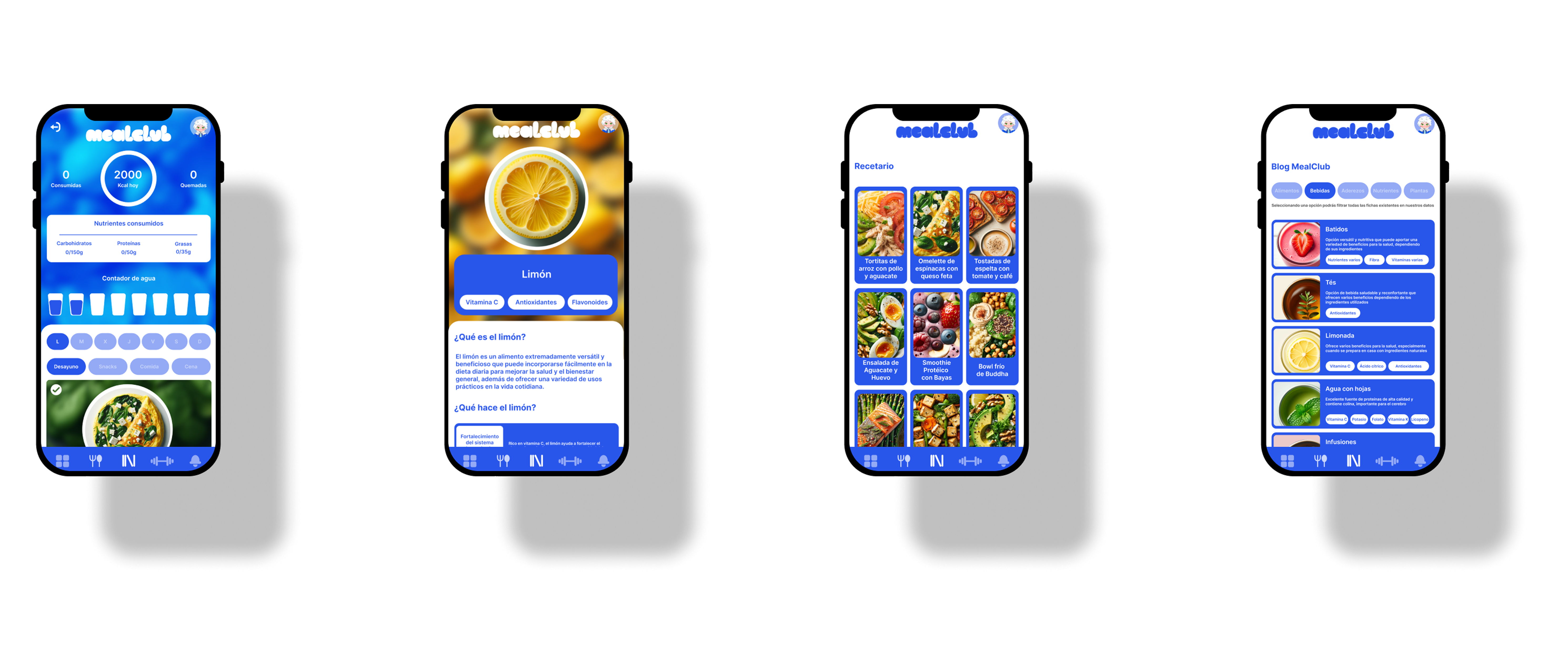
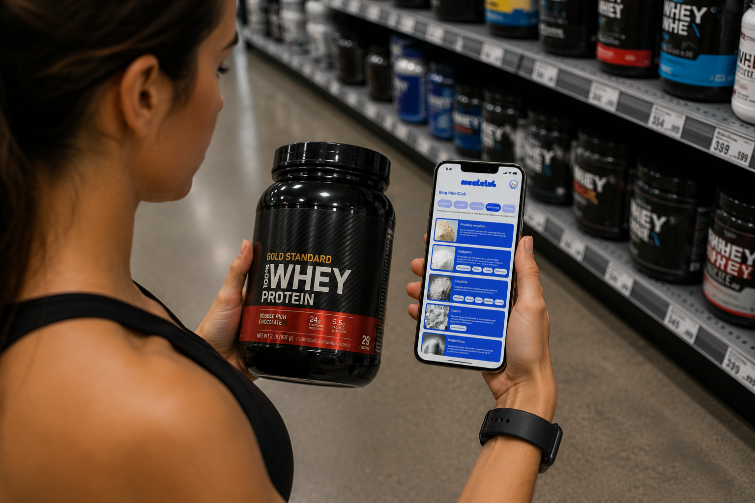
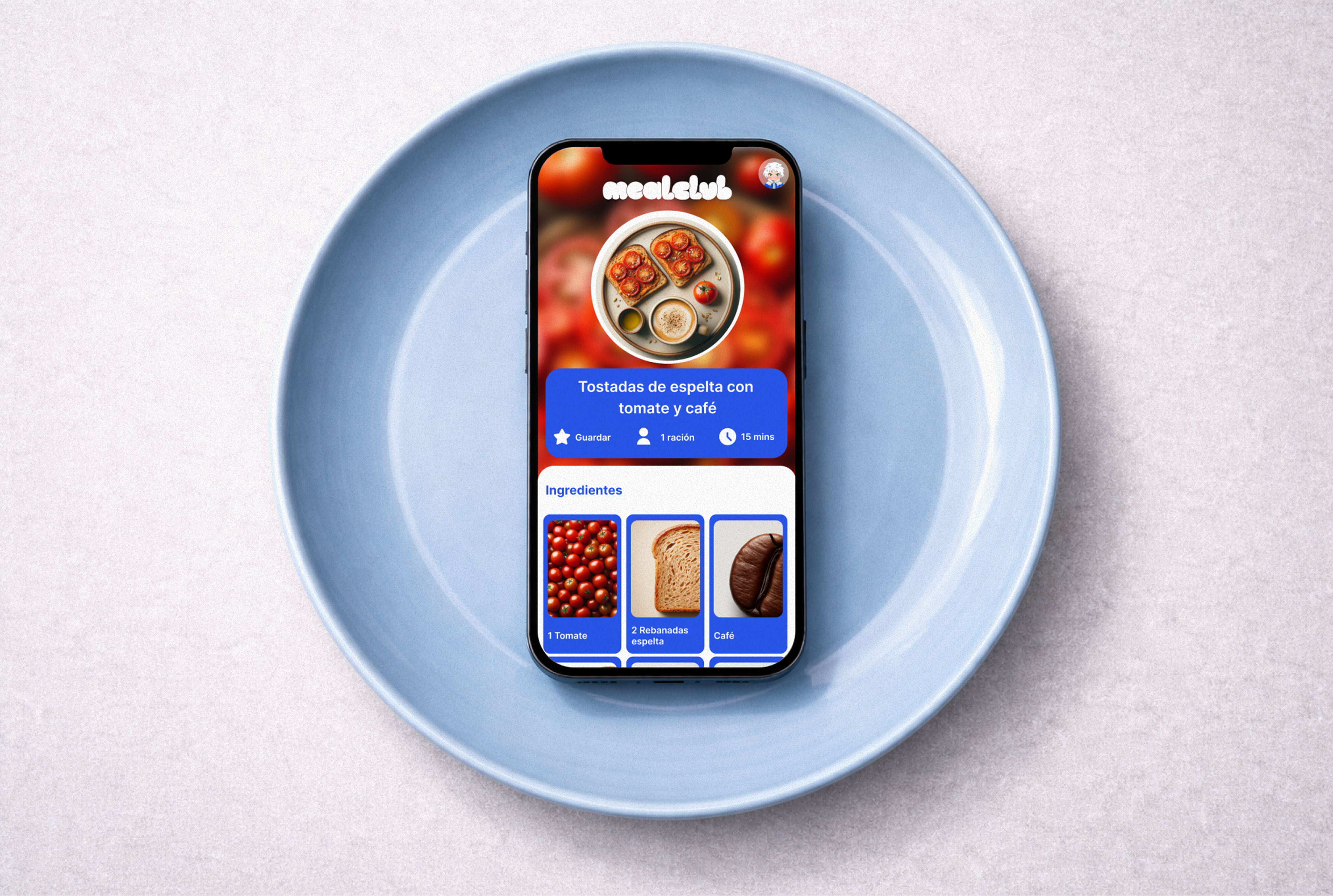
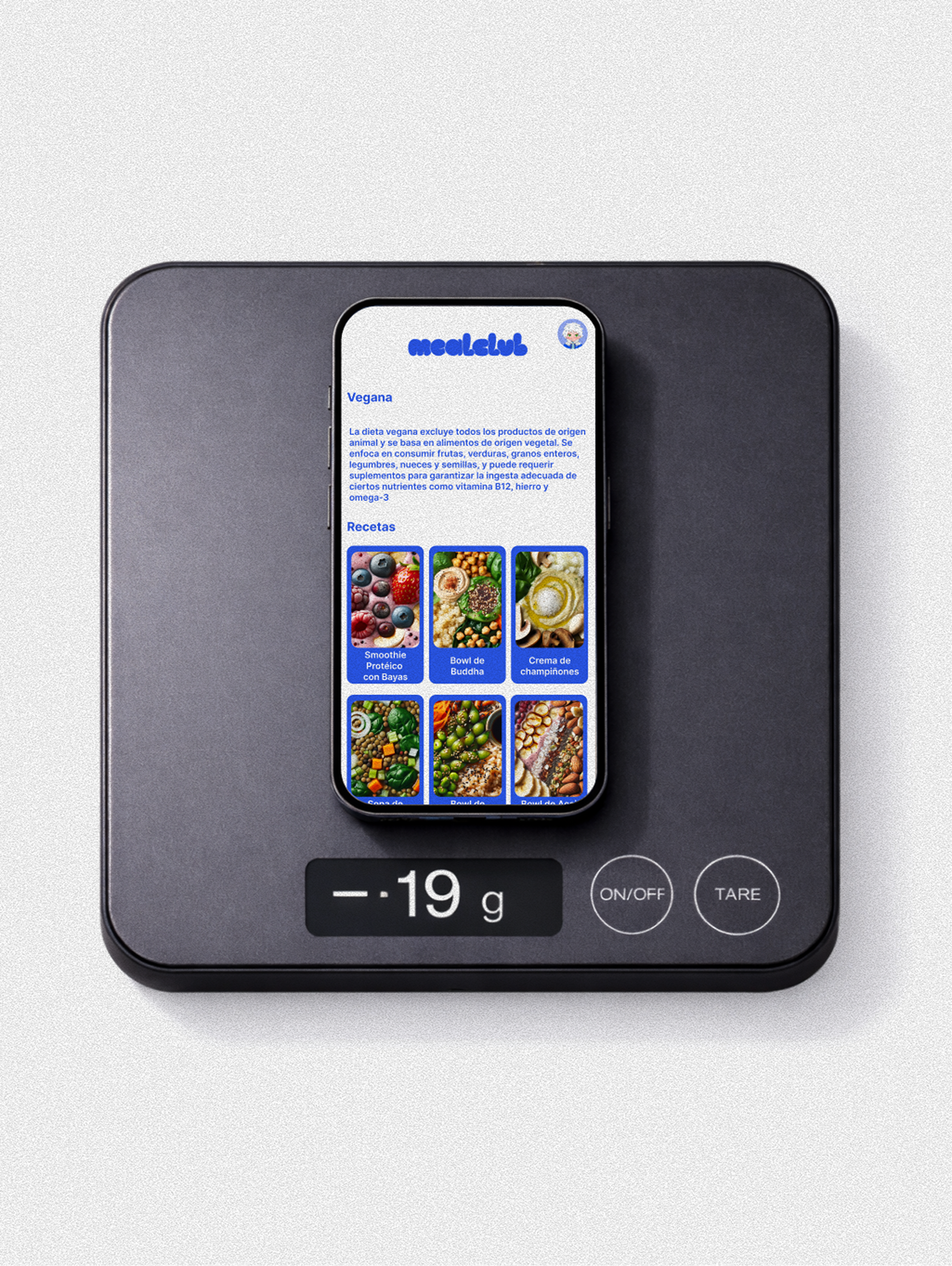
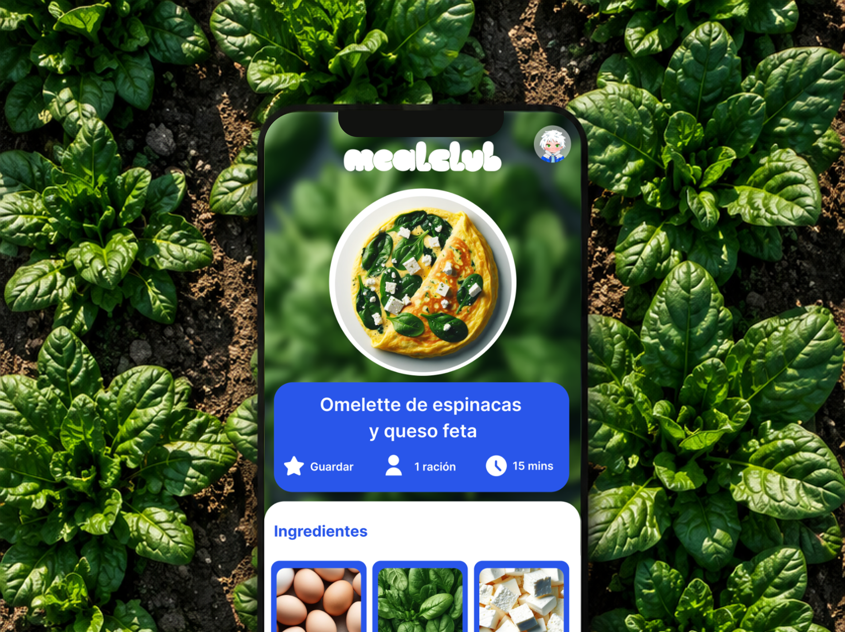
MealClub provides clear meal suggestions that feel practical, visual and easy to compare.
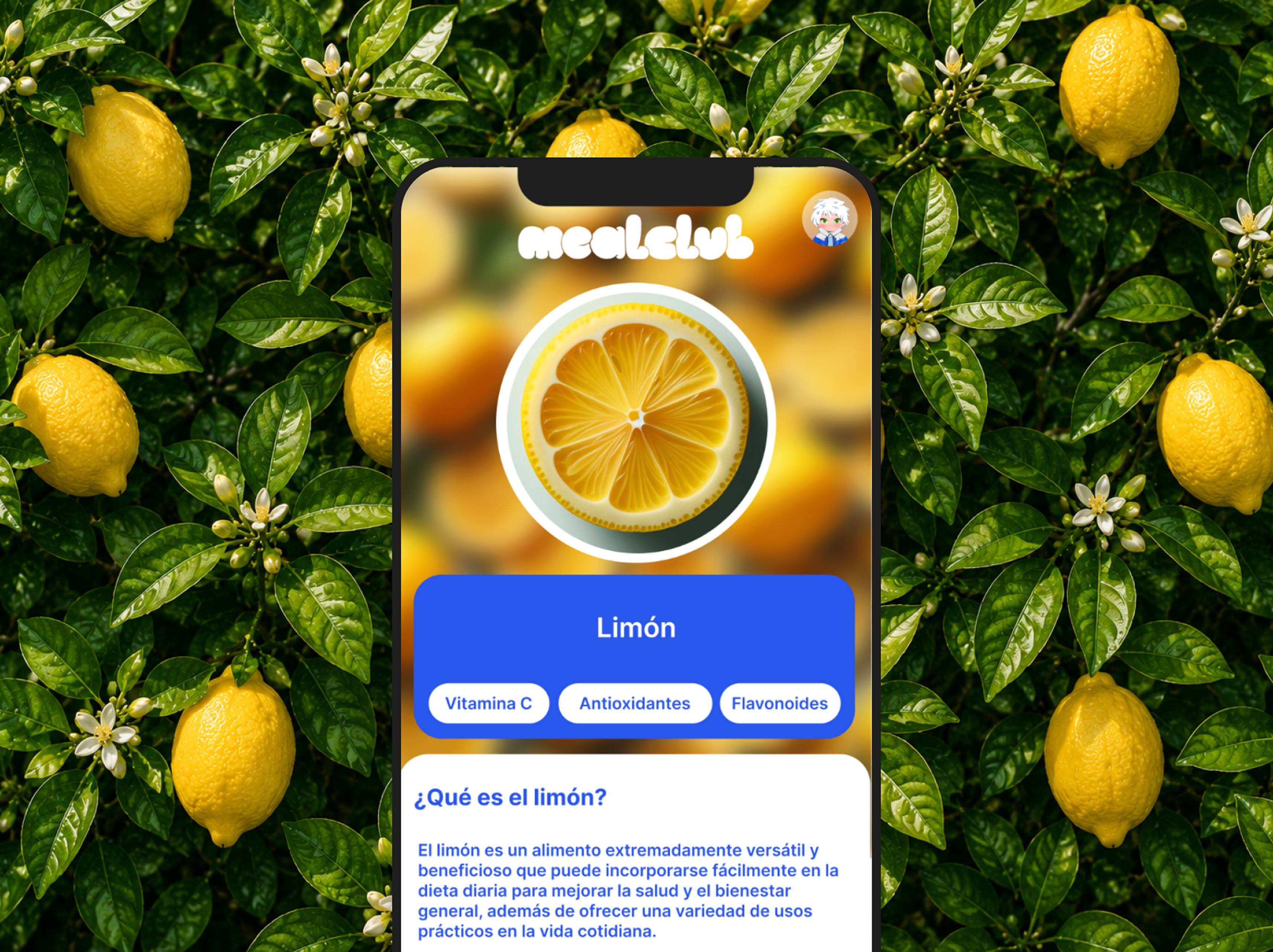
Each recommendation includes simple explanations that help users understand why it fits their context.
Users can save meals, organise ideas and start building a more repeatable routine over time.
Each product area has a dedicated experience system,
so users can understand what they can do at each moment.
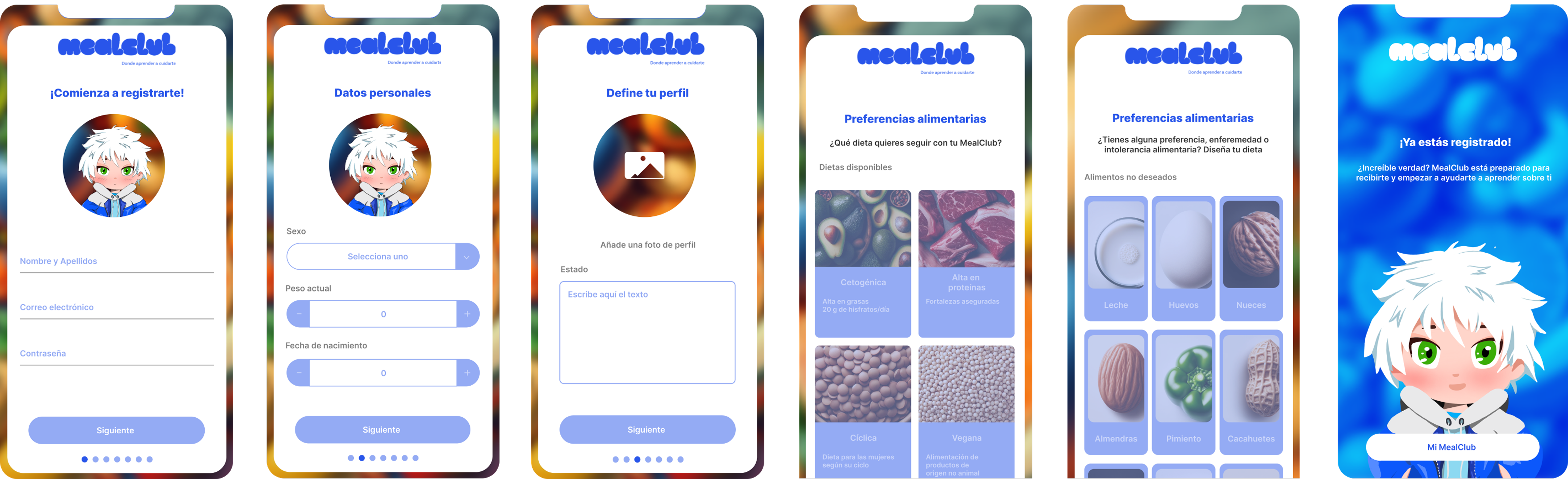
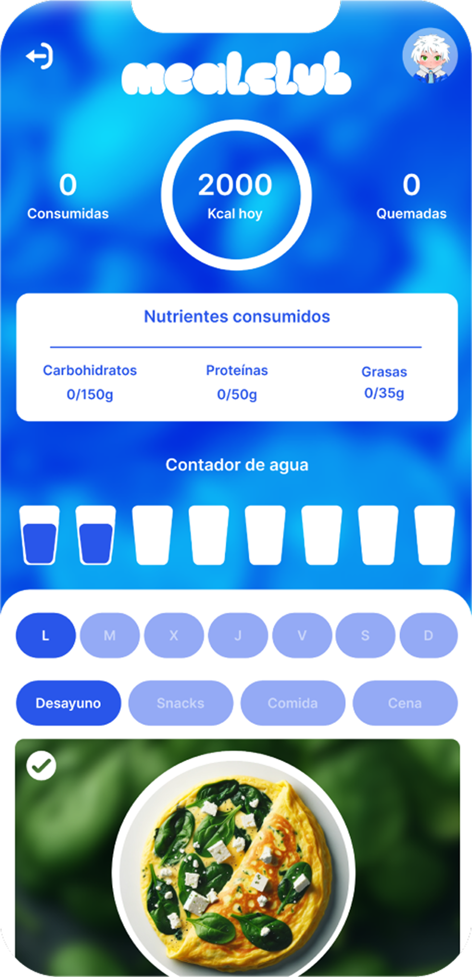
Onboarding works as a visual entry point,
condensing key information into a few clear steps.
UX/UI System
How the product logic becomes an interface
The UX/UI system makes MealClub’s strategy usable through repeatable modules and predictable navigation.
Screens are built around clear content hierarchy, reusable cards and actions that are easy to understand.
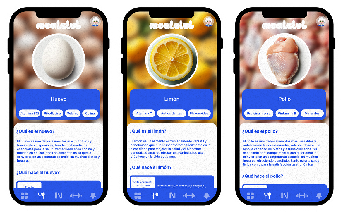
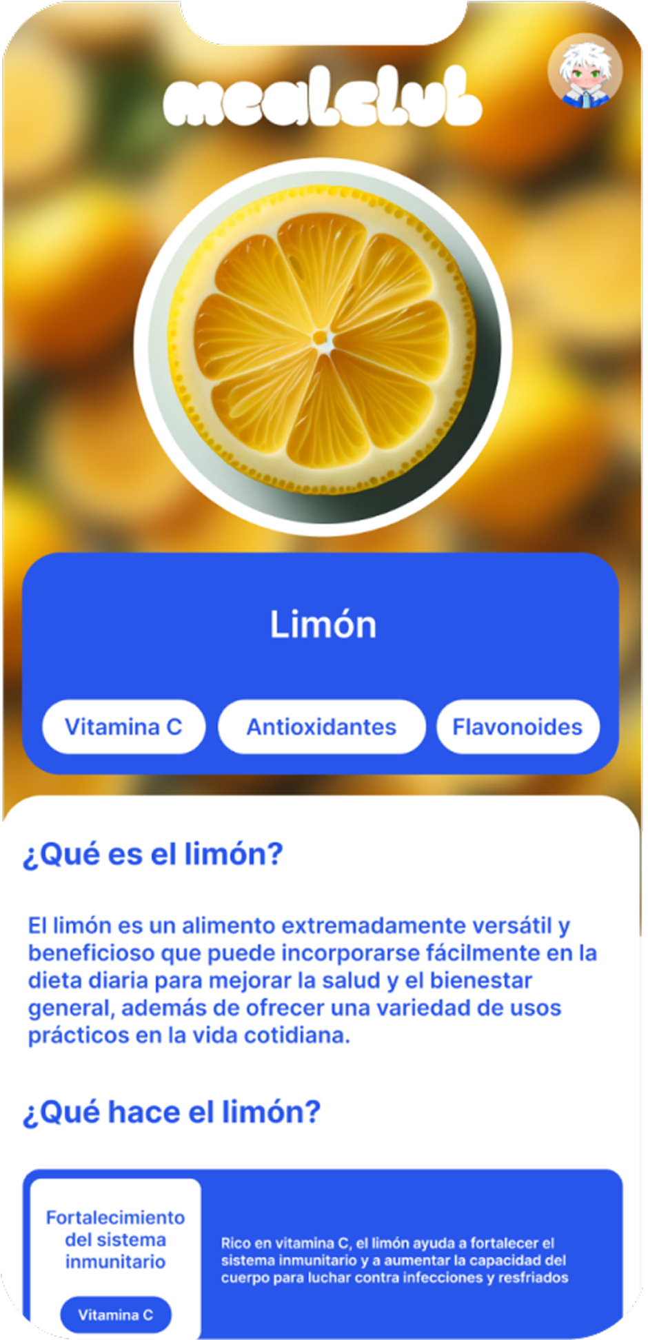
I designed navigation, recipe cards, learning blocks and saved actions as reusable interface pieces. The goal was for users to understand what each screen offers, what action is available and why a recommendation matters without decoding dense nutrition data.
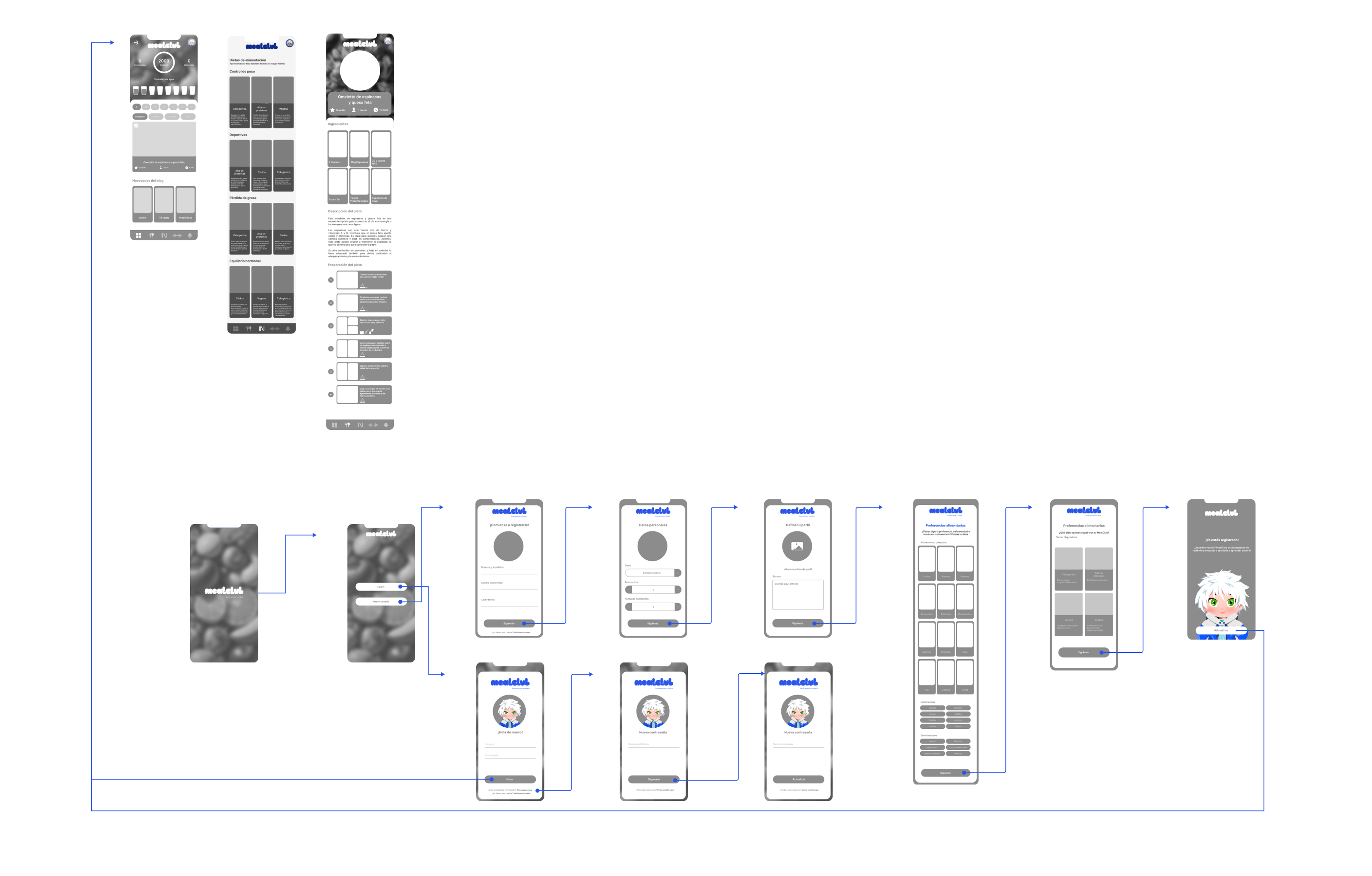
Low-fidelity wireflow showing onboarding and navigation logic.
The flow reduces steps from setup to discovery and action.
Users quickly understand where they are, what each screen offers and what action comes next.
Recipes, ingredients and learning content use reusable cards, making the system easier to scan, extend and maintain.
Images, icons and colour coding reduce scanning effort and help users connect food choices with context at a glance.
Stack
Phase 5.1 · Building the product system
I built MealClub as a connected product system, combining interface design, front-end structure and organised data logic.
I connected interface design, front-end structure, server-side logic and database management. The technical setup translated UX decisions into reusable templates, responsive foundations and organised data flows.
Highlights
Phase 5.2 · What this project shows
MealClub shows how product strategy, UX research and interface design can turn a broad nutrition challenge into a focused food-learning product.
The project connects research, onboarding, recommendation logic, visual systems and implementation-aware design to make food decisions easier to understand, adapt and repeat.
"MealClub shows how UX research, product strategy and interface design can turn everyday nutrition into a clearer, more repeatable food-learning experience."
Product
Meal planning mobile app focused on food learning, recommendations and MVP UX.
Product
Marketplace UX redesign for clearer property search, comparison and decision-making.
Confidential SaaS
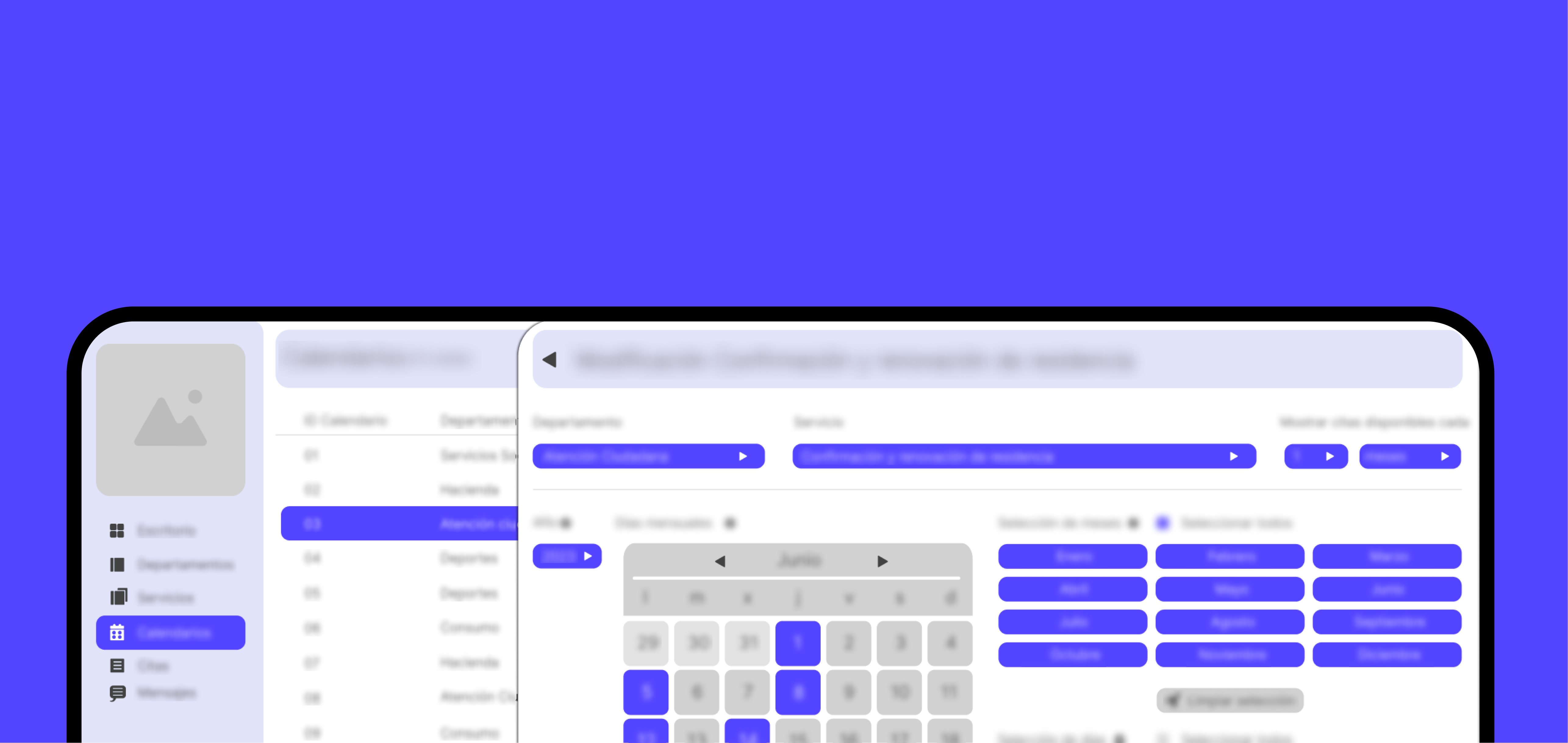
Operational UX for tickets, appointments, schedules, tasks and employee workflows.
Confidential Website
Public service website focused on clear information and accessible navigation.
Website
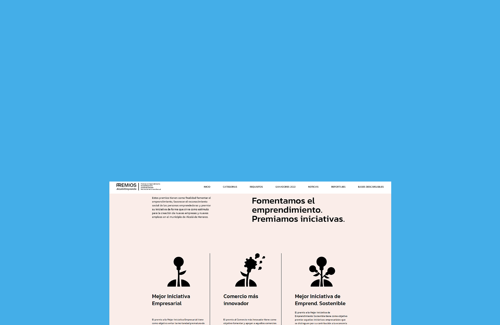
Event website and cultural communication structure for an awards experience.
Product
Sensory wellbeing wearable ecosystem for emotional awareness and calm interaction.
Product
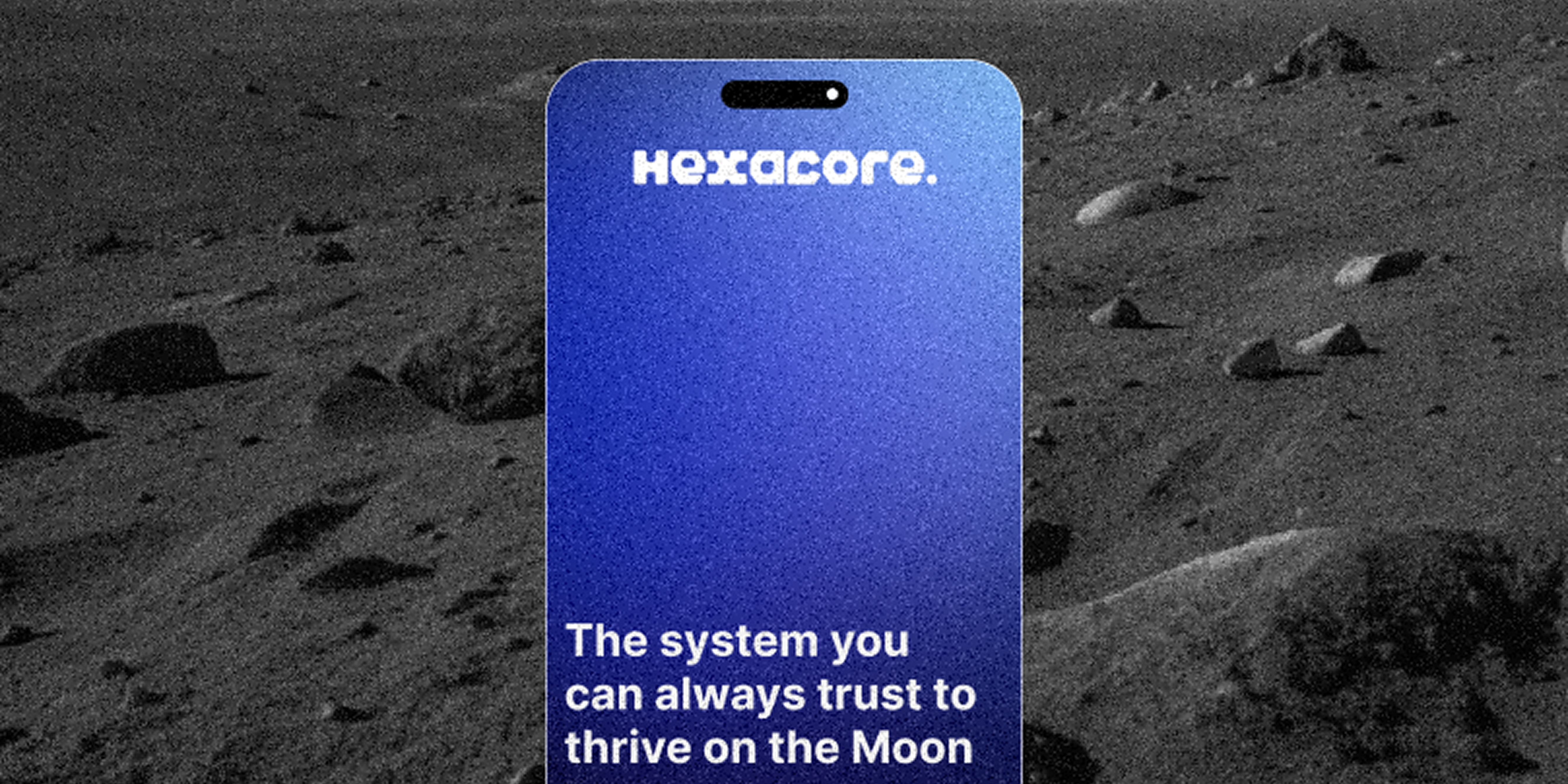
Voice-first assistant concept for hands-free robotic support in extreme environments.