
Helena Fernández
Miralpeix
 Projects
About
Projects
About


Product Design
UX/UI
Information Architecture
Service Design
Digital Strategy
Brand Experience
Independent UX redesign of an existing real-estate marketplace · 2025
Helena Fernández
Miralpeix
Product Designer
UX/UI Designer
Brand Strategy
This independent redesign explores how Idealista could evolve from a listing-based marketplace into a clearer decision-making experience for people searching, comparing and choosing a home.
The case reframes a listing-heavy marketplace around search intent, comparison, filtering logic and decision support.
Independent redesign. This project is an independent UX/UI exploration and is not affiliated with Idealista.
The goal was to analyze the current search and decision-making experience and propose a clearer product direction.
Overview
What the product is about
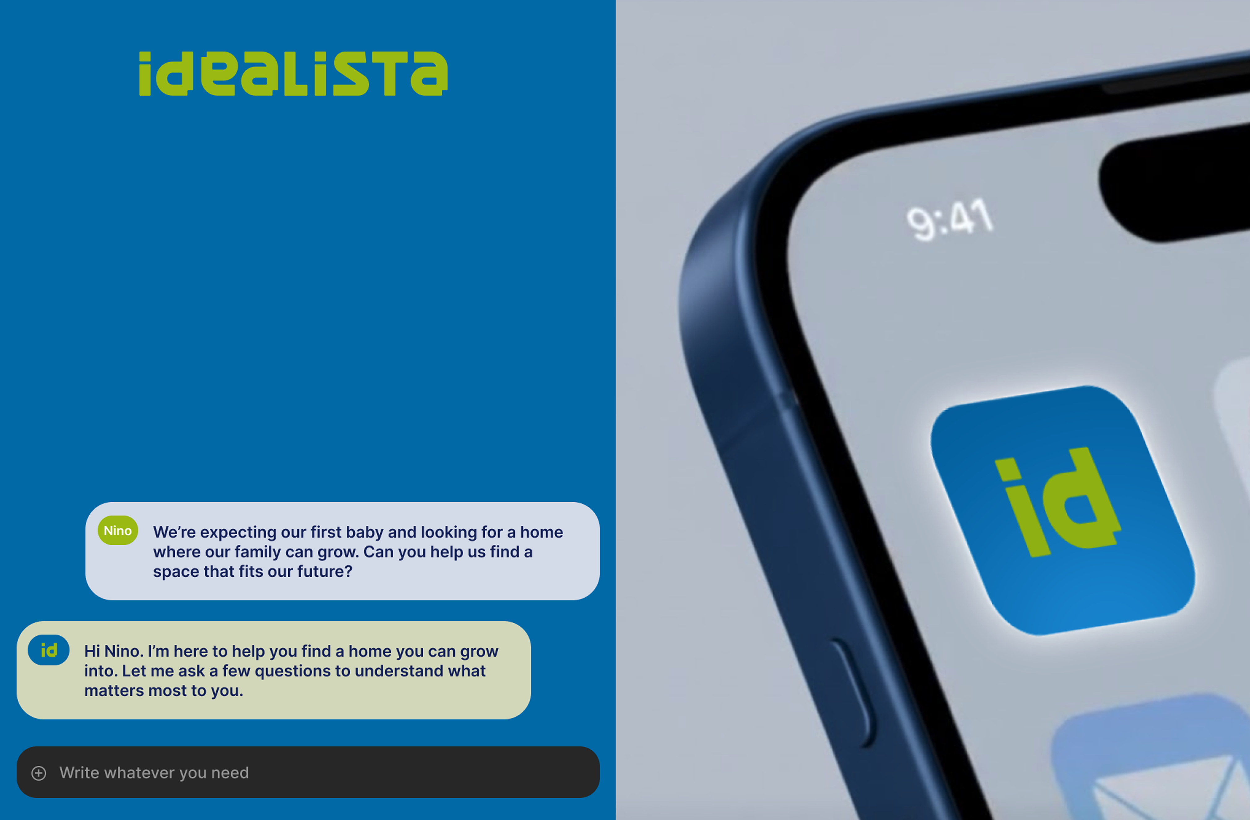
Idealista Redesign reframes property search as a guided decision experience. The product helps users compare homes, understand trade-offs and act with clearer priorities.
The goal was not to refresh screens in isolation, but to reorganise search, filters, property information and comparison moments around product clarity.
A marketplace UX redesign focused on property search, filtering, comparison and user confidence.
The experience supports users as they balance location, budget, property condition and future potential.
I led UX strategy, information architecture, interface redesign and brand-system adaptation.
Platform audit:
Reviewed IA, search flow, listing structure and visual hierarchy.
Strategic repositioning:
Reframed the platform from search-and-browse to guided decision-making.
UX architecture:
Reorganised entry points, filters, property modules and comparison moments.
Interface and brand direction:
I built a modular UI language with clearer hierarchy and recognition.
Service experience logic:
Connected inspiration, saved searches and property evaluation into one flow.
An independent UX redesign of an existing real-estate marketplace, focused on search, IA, service experience and product clarity. It is not affiliated with Idealista.
I covered platform analysis, filtering logic, content hierarchy, key flows and UI system.
Product analysis, UX mapping, brand strategy and interface design.
Key product decisions
From browsing to decision support
Idealista Redesign reframes property search as a decision-making journey, not just a browsing experience.
The case connects information architecture, comparison logic, AI-assisted filtering and interface hierarchy to help users evaluate options with more clarity and confidence.
The case focuses on a high-consideration decision: users are not only looking for listings, they are comparing price, location, lifestyle, condition, commute, emotional fit and confidence before taking action.
Insight
Phase 1.1 · Current experience analysis
Real estate search is not only a filtering task. Users need to understand whether a place can fit their life, budget and future plans.
The opportunity was to keep search efficient while adding structure, orientation and clearer decision support.
Property platforms are useful, but often leave users comparing dense information with little guidance.
Guide users through needs, area discovery, improvement potential and comparison without slowing search.
A more modular, visual and decision-oriented property experience.
"The opportunity was not to show more homes. It was to help users understand which home makes sense for them."
User needs
Phase 1.2 · Search and decision use cases
I defined the product direction around users who need orientation, comparison and confidence during a high-impact decision.
Platform strategy
Phase 2.1 · From listing search to decision support
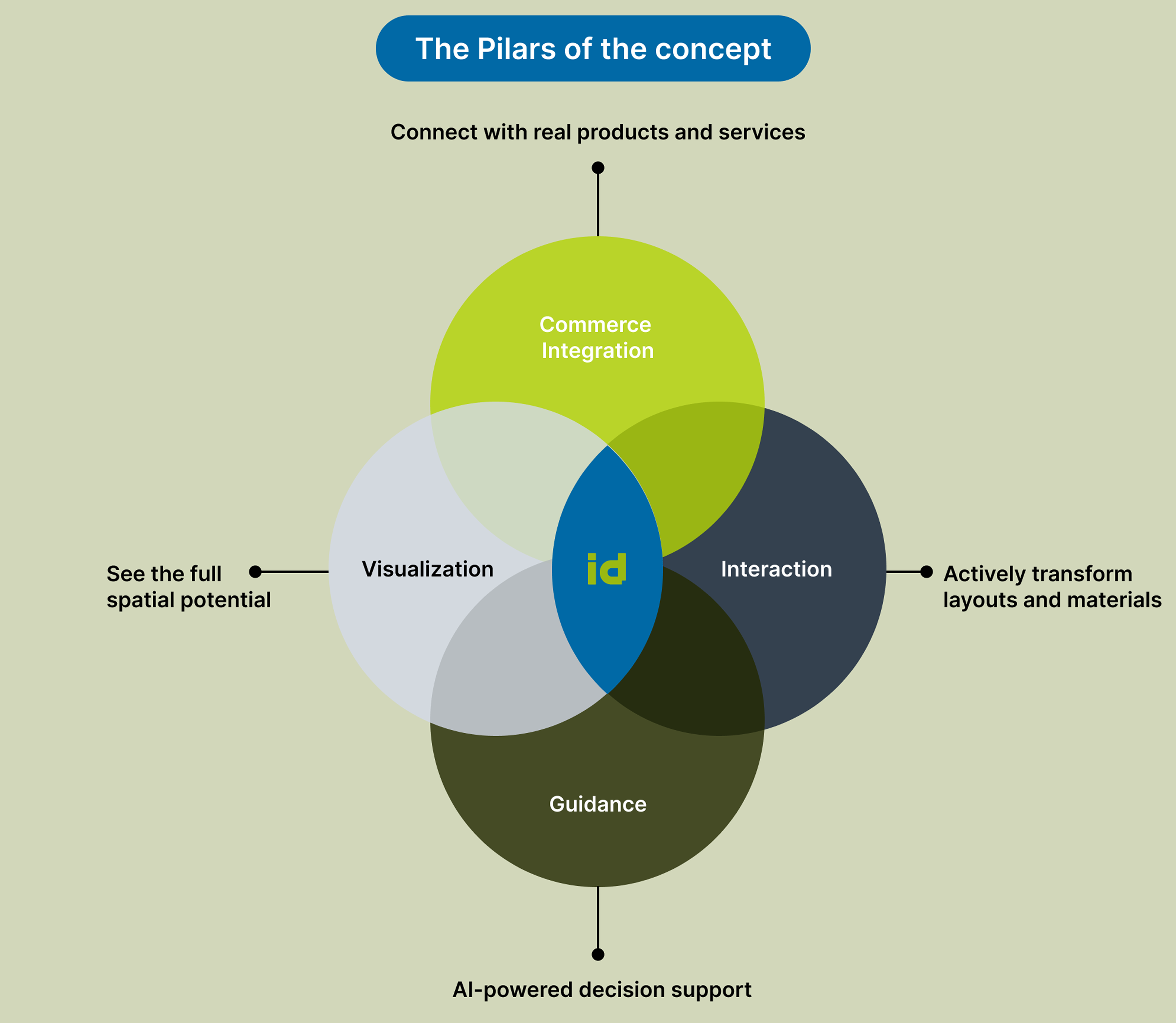
The new strategy reframes Idealista as a platform for searching, understanding, comparing and imagining homes through clearer product modules.
The experience is organised around key journeys: buying, renting, selling, discovering areas, finding agencies and comparing saved options.
Existing high-value features are kept, but reorganised around user intent instead of catalogue density.
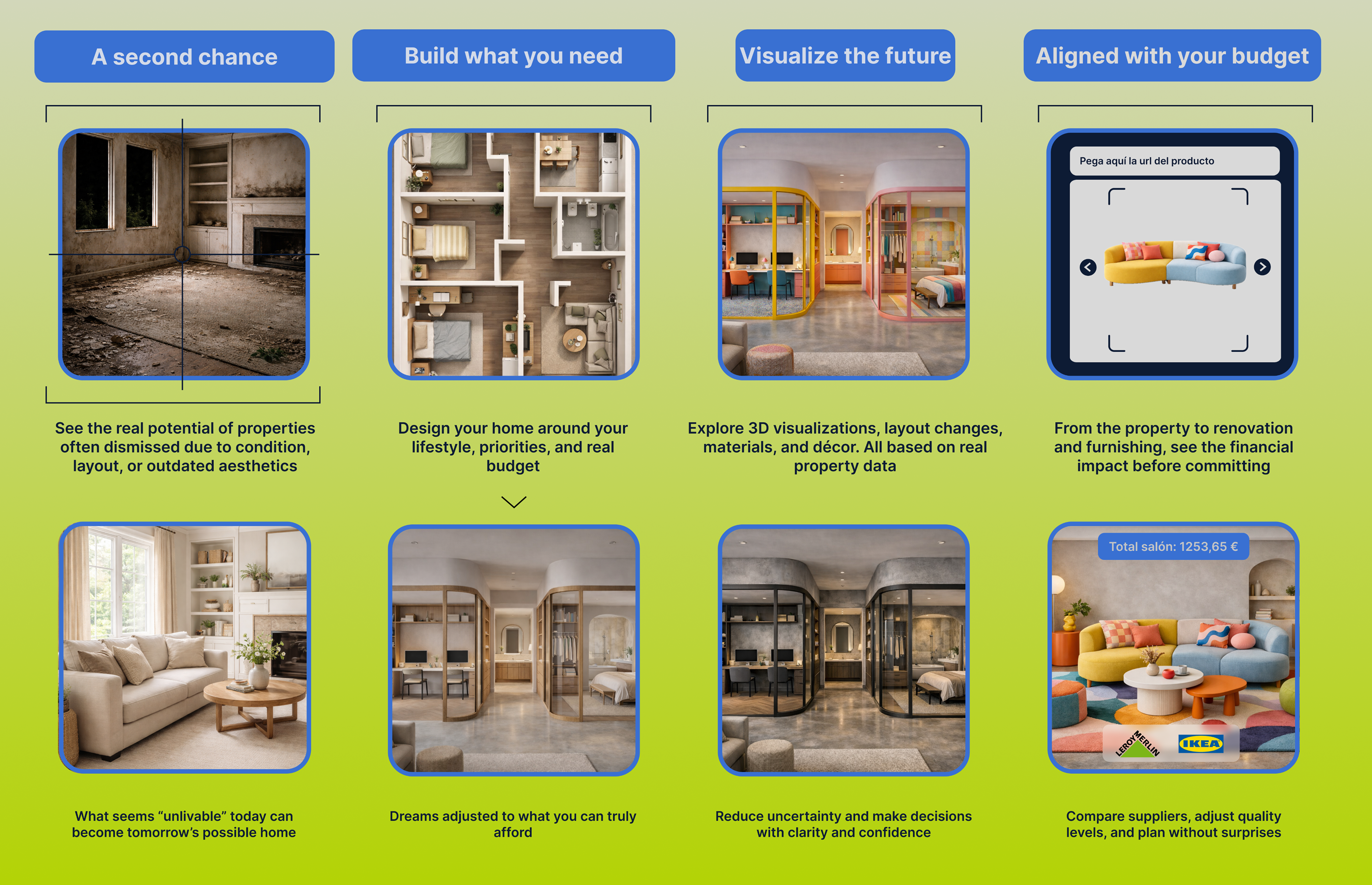
Clear entry points for fast, precise property discovery.
Area guides and lifestyle discovery help users explore before filtering.
Saved homes and modular cards connect price, potential and priorities.
Contact, agency recommendation and publishing become clearer conversion paths.
Product positioning
Phase 2.2 · Defining the new product angle
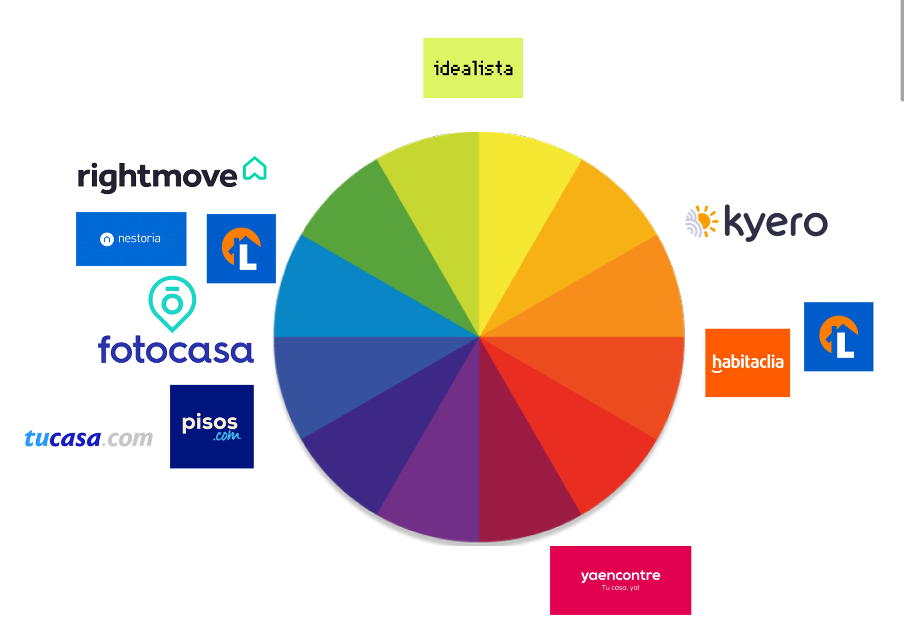
Product positioning started with a market read of direct real estate platforms and indirect lifestyle references.
Using a colour wheel, competitors were mapped by visual territory, tone and promise. The exercise showed where Idealista could keep its recognition while moving toward a clearer launch idea: practical search with a more guided, aspirational view of home decisions.
The lime green stays because it is a strong memory asset, but the system refines it into a brighter product language for the new concept.
Blue works as a support layer for guidance, AI modules and decision-making moments.
MVP Experience
Phase 3.1 · Defining the main product flow
The MVP experience becomes a clearer decision flow: choose intent, refine context, compare options and move towards action.
New product moments support users before and after search: area exploration, saved comparisons, renovation potential, budget scenarios and agency recommendations.
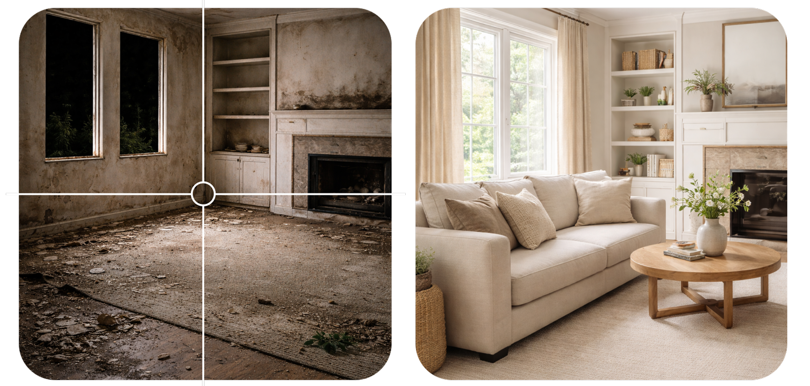
The user can understand not only what is available, but what each option could become.
Entry adapts to buying, renting, selling, exploring areas or finding support.
Filters become inputs for lifestyle, budget, area and priorities.
Saved lists and comparison modules help users organise choices.
Contact, service requests, publishing and exploration become clear next steps.
UX/UI System
How the product logic becomes an interface
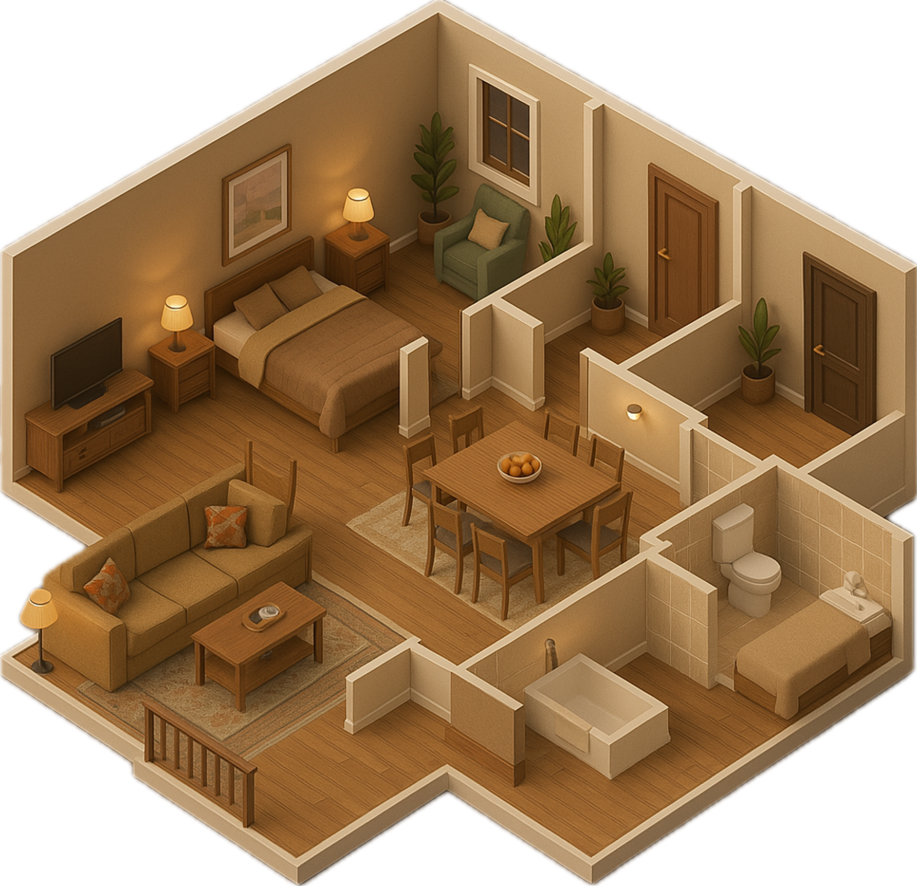
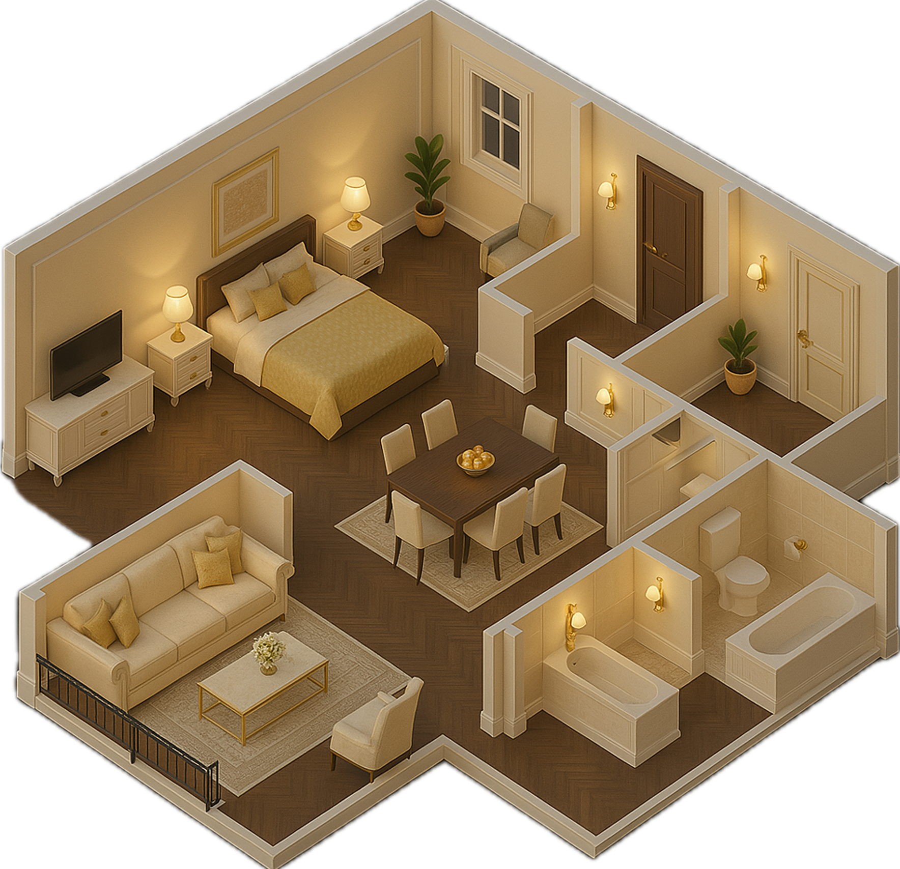
The UX/UI system is a modular product layer for search, comparison, visualisation and service tools.
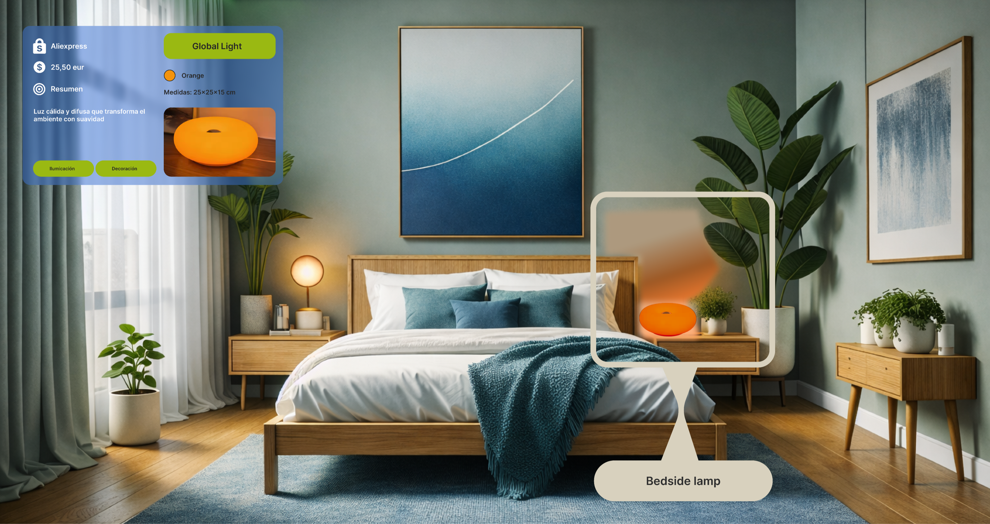
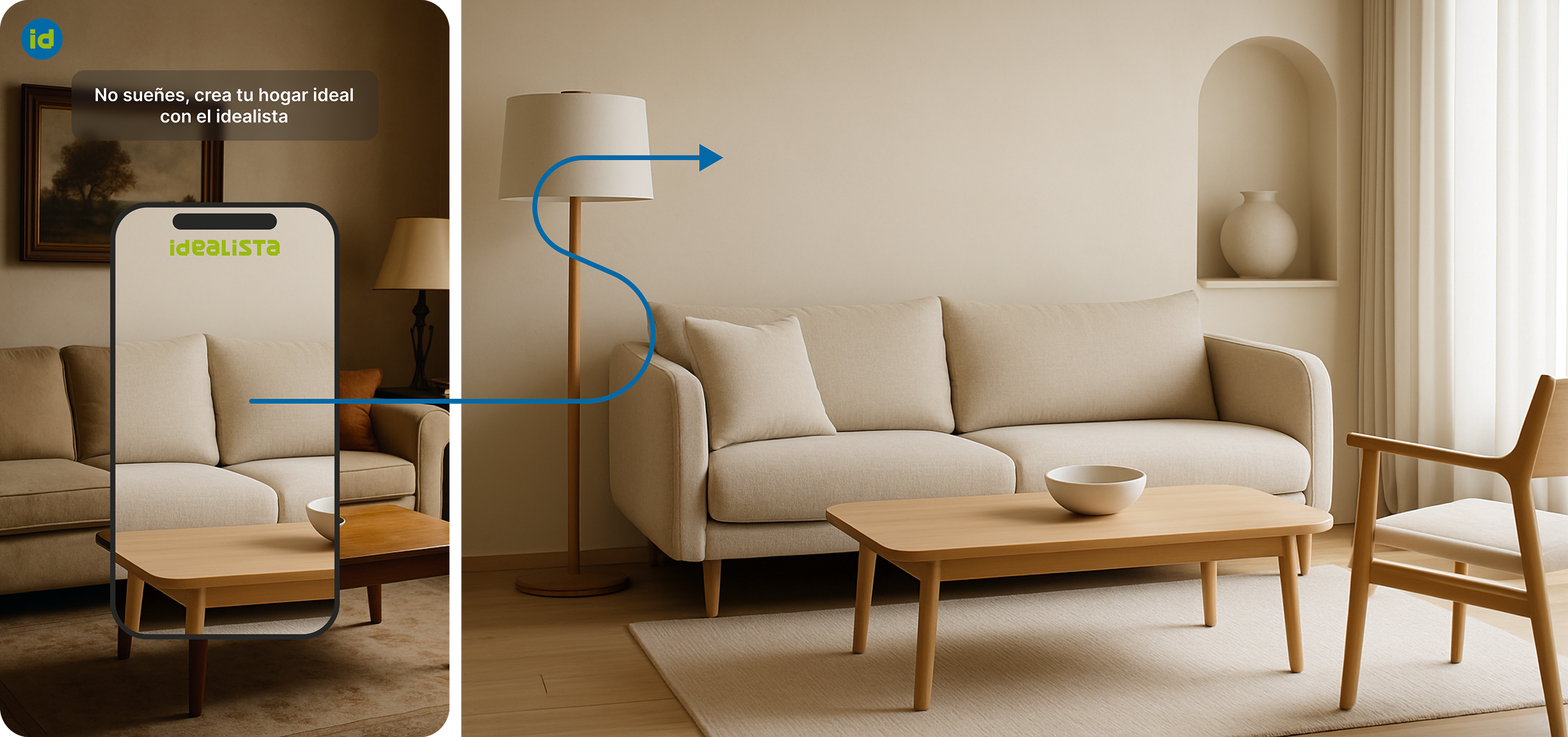
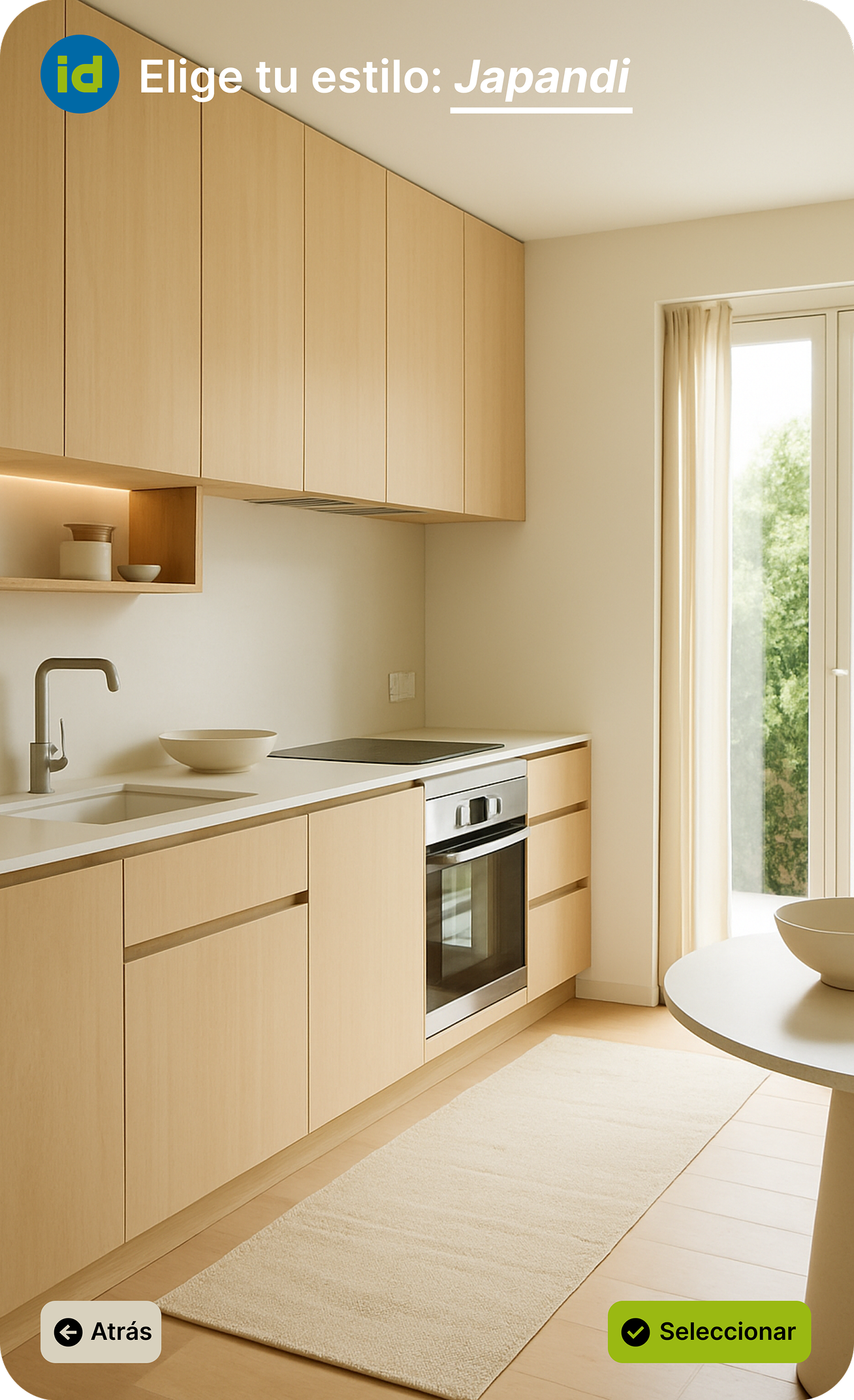
AI and API-supported modules let users preview references, furniture or product URLs inside a listing at real scale.
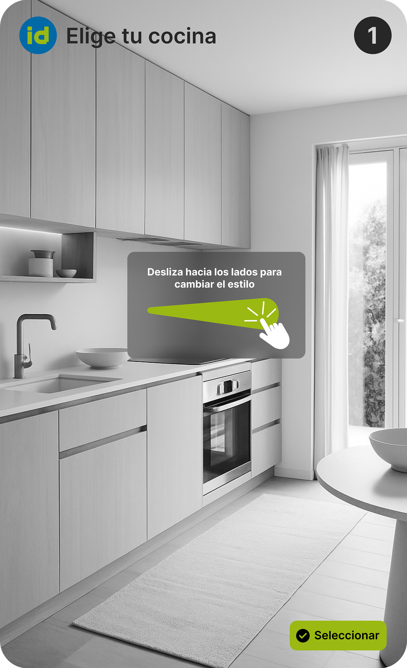
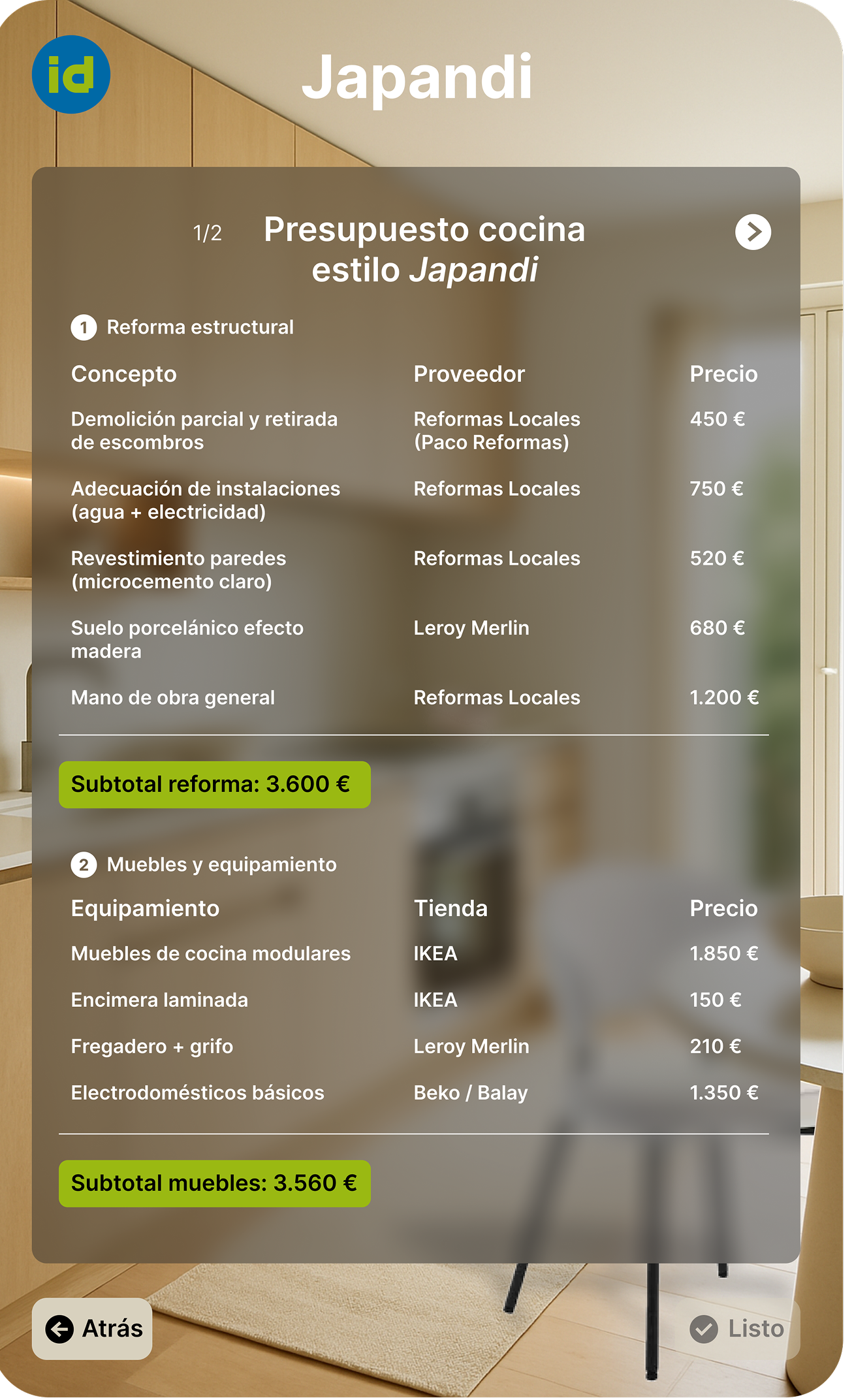
The interface helps users switch between current state, renovation potential, decoration options and budget-based improvements.
APIs connect catalogues, room measurements, renovation ranges and property data so each listing becomes more actionable.
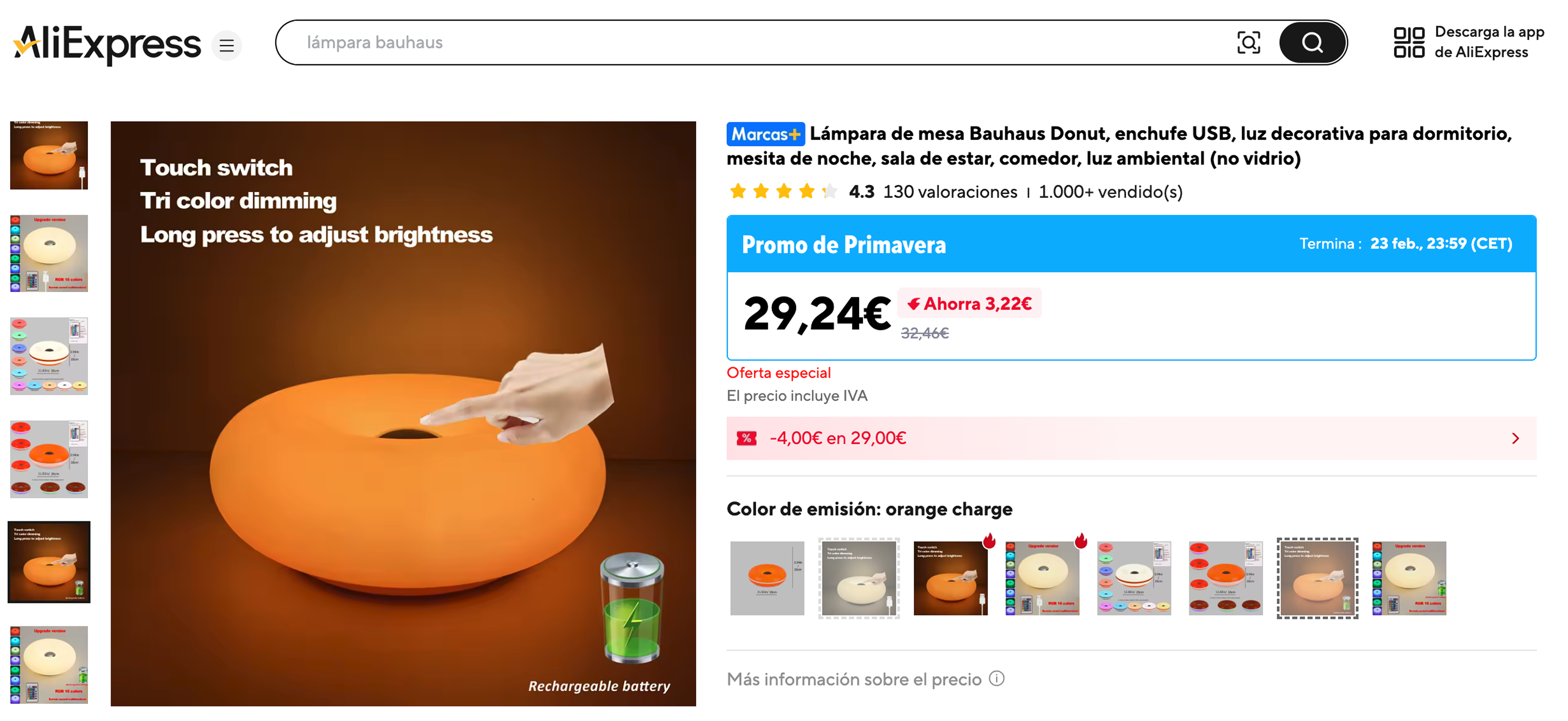
Modular interface logic: search modules, AI recommendation blocks,
property cards, URL paste actions and real-scale previews.
The system can scale without losing clarity.
Users can view current layout, renovation potential, decoration direction or budget-based transformation.
Users paste product URLs to preview real items inside the rooms they are evaluating.
Dimensions, budgets, products and renovation options keep recommendations realistic.
Scalability
Phase 5.1 · Product ecosystem and future growth
Idealista Redesign is designed as a scalable platform system for search, agencies, publishing, editorial content and personalised recommendation flows.
Guided modules can keep growing around areas, comparisons, priorities and improvement scenarios.
The core property search remains the platform’s main utility, but becomes clearer and more guided.
Guides, inspiration and neighbourhood information help users make more informed decisions.
Agency recommendations and publishing flows connect the product with business conversion points.
Personalised prompts and saved comparisons keep decisions tied to budget and feasibility.
Highlights
Phase 5.2 · What this project shows
Idealista Redesign shows how a mature marketplace can evolve by reorganising information, clarifying decisions and strengthening comparison flows.
The case highlights marketplace UX, information architecture, filtering logic and decision support for a high-stakes search experience.
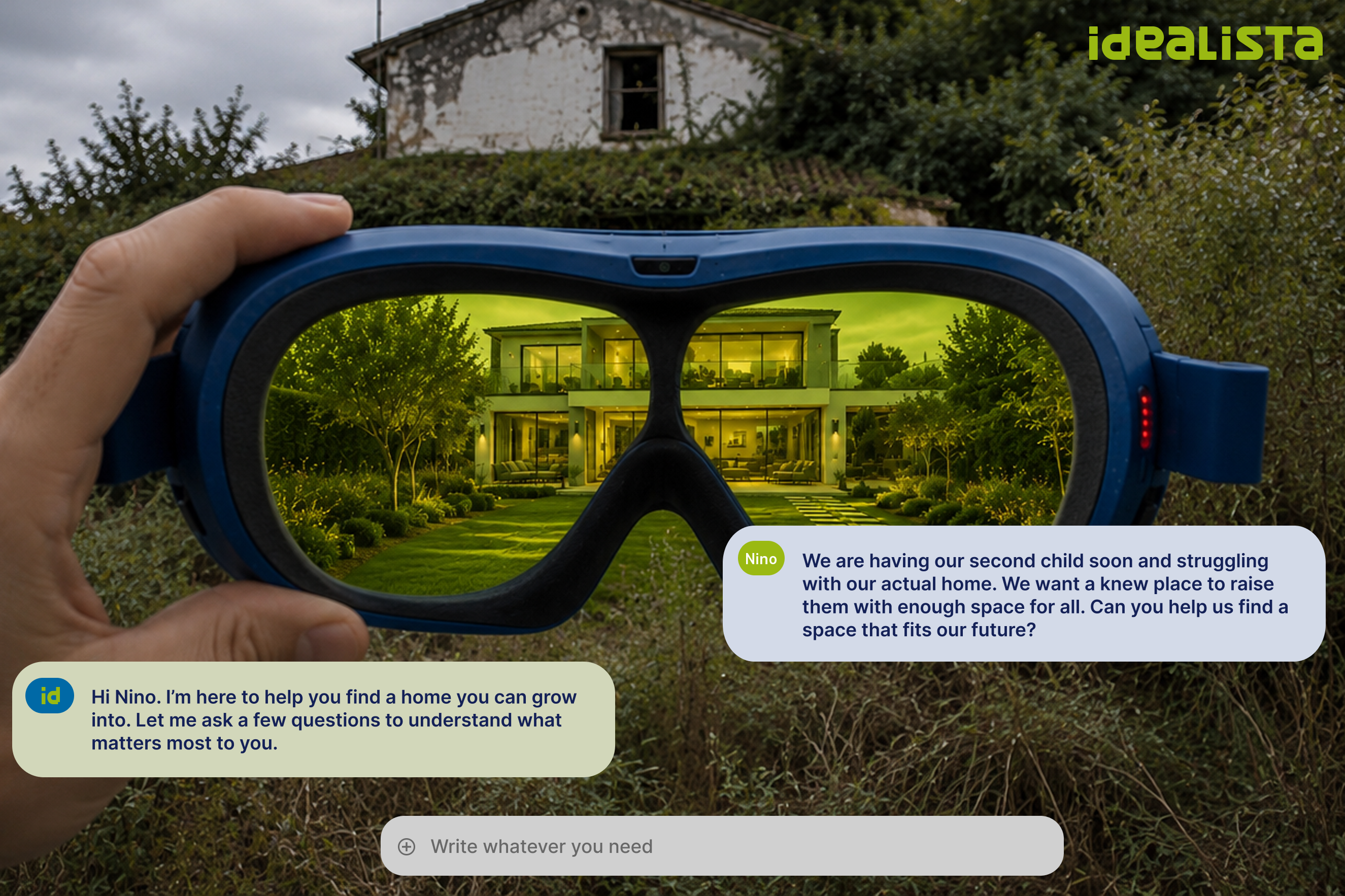

"This case study highlights how property search can become a clearer decision system without losing marketplace familiarity, speed or practical constraints."
Product
Meal planning mobile app focused on food learning, recommendations and MVP UX.
Product
Marketplace UX redesign for clearer property search, comparison and decision-making.
Confidential SaaS
Operational UX for tickets, appointments, schedules, tasks and employee workflows.
Confidential Website
Public service website focused on clear information and accessible navigation.
Website
Event website and cultural communication structure for an awards experience.
Product
Sensory wellbeing wearable ecosystem for emotional awareness and calm interaction.
Product
Voice-first assistant concept for hands-free robotic support in extreme environments.